
Deconstruction of an existing schools film opening using the OCR production mark scheme:
Sound:
- There is no diegetic music in the film opening, apart from a scream with the opening credits, the rest is music, edited to fit what is happening on screen.
- The opening music seems appropriate for a film opening, while the credits are coming up.
- Music played throughout scenes with the girl walking is creepy and creates tension, clearly building up to a dramatic moment, with the use of strings and possibly a piano-type instrument.
- Music cuts out quickly and unexpected, then we hear a scream while the film title comes up (the word S P I T E, in white on a black background), I felt like this scream didn't really sound professional, it just sounded a bit pathetic so the whole film opening becomes less professional.
- The music then returns while the black screen is still showing, and for me personally I feel it would have been better to make it start later when the actual footage is playing. Apart from that, the music is more mysterious as the audience are probably a bit unsure of what just happened.
- The pitch of the music suddenly increases as the hand grabs the girl, I felt this wasn't exciting enough to match the footage as the hand is supposed to make the audience jump and I feel that if they had made the music fit with that, for example going from silent to a loud noise, then it would have been more effective in surprising the audience.
Camera Angles and Movement:
- The opening starts off with a tilt shot, moving from the ground to the sky, showing that this is set in a wooded area (further shots then back this up) and I particularly liked the way the sunlight came through the trees as the camera moved, they also use another tilt shot to show another tree a bit later on.
- I also liked the shot of the leaves blowing on the ground as the camera was really low, almost on the ground and that emphasised the leaves even more, better than a normal looking down shot as you also get more of the background in it.

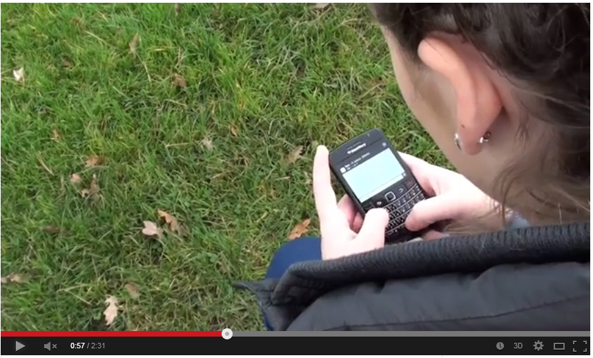
- They use a variety of angles while in the opening moments which are effective, the 'first' (not with titles) is a 'behind the subject' shot while the girl is walking I also thought the use of the two close up shots were very effective, the over the shoulder shot, so you can see her hands typing and also the extreme close up shot of the screen so the audience can read what is being said. The only thing with this is that in the reflection of the screen you can see some sort of shadow which could be a camera and a person holding it, but to be fair to them it could have been a lot worse.
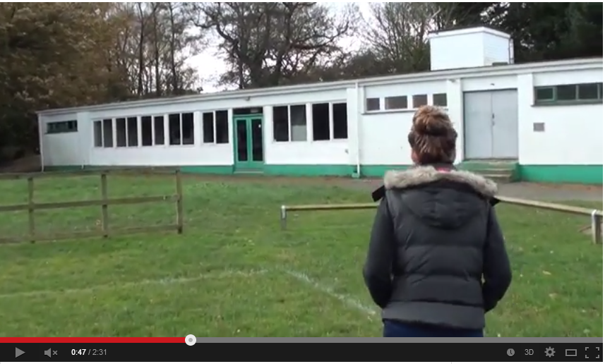

- As she gets up and walks away, the camera is moved up slightly bit by bit and as it follows her the camera isn't as steady as it could be and it makes it appear less professional.
Mise En Scene
- As this film opening is mainly filmed in a wooded area, there isn't much mise en scene, however they have included shots of things which may have been there already or they deliberately placed them there for effect.
- During the credits, there is a shot of some blue rope swinging in the wind but it does not explain what the rope is for, leaving it up to the audience to decide (although it does appear at 1.33 as the second girl starts to follow the first.

- The first girl is wearing typical teenager clothing, jeans and a body warmer and she has her hair in a bun and she uses a blackberry phone, the second girl is wearing all black and the boy is also wearing normal clothing, this is to show that they are all just normal teenagers.


- There is also a moment at 1:49, where shot is taken from behind a pile of dirty and suspicious looking bags, similar to sand bags, maybe hinting that there is something dodgy inside which shouldn't be in there.

- All the lighting in the scene is natural, there doesn't appear to be any artificial light used during filming and this is effective as it makes the footage more realistic and believable.
Editing:
- Apart from the credits and opening title, there aren't many examples of complicated editing which is the one main thing which could lower the overall mark. Mostly straight cuts are used to separate one camera angle from another, although this is representative of some film openings, where there is a lot of different camera angles of almost the same thing and the opening has a linear narrative. There were a few examples of match on action shots, for example when she walked around the building, there was a shot from behind and then one from in front.


Titles:
- During the opening credits, the words are layered onto the video itself rather than on a non-moving background and this is so the audience can see the location of the opening, without it being long and boring. This is effective as it gives the audience an idea of where the main characters are, using different camera angles such as tilt, compared to if they had chosen to put the opening credits on the actual clips of the girl walking etc, because it would have drawn attention away from her and what was actually happening.

- The title (2:10), 'SPITE' comes up on a black background and a letter comes up separately one after the other, this animation reminds me of casino machines, where a number of different letters appear until the chosen letter comes up and stays there. I thought choosing the black and white colour theme was simplistic and yet effective as it gives the impression of good against evil, maybe hinting that the girl in all black was the 'villain'.

In my opinion, I do think that the opening has the features of a general film opening and does not resemble a trailer or a small section of the film. It doesn't introduce too many characters, only 3 who seem to be important to the storyline. I also didn't like the girl's 'wound', I felt it was not realistic at all and ruined the quality of it, I do however understand that it can be difficult to create effective and realistic wounds, but they don't seem to have tried to improve it at all. Overall I would say it was quite successful and would give it approximately somewhere between 45-50 marks out of 60.

No comments:
Post a Comment