Showing posts with label Practical Investigation. Show all posts

Thursday, 13 March 2014

Typography on Photoshop

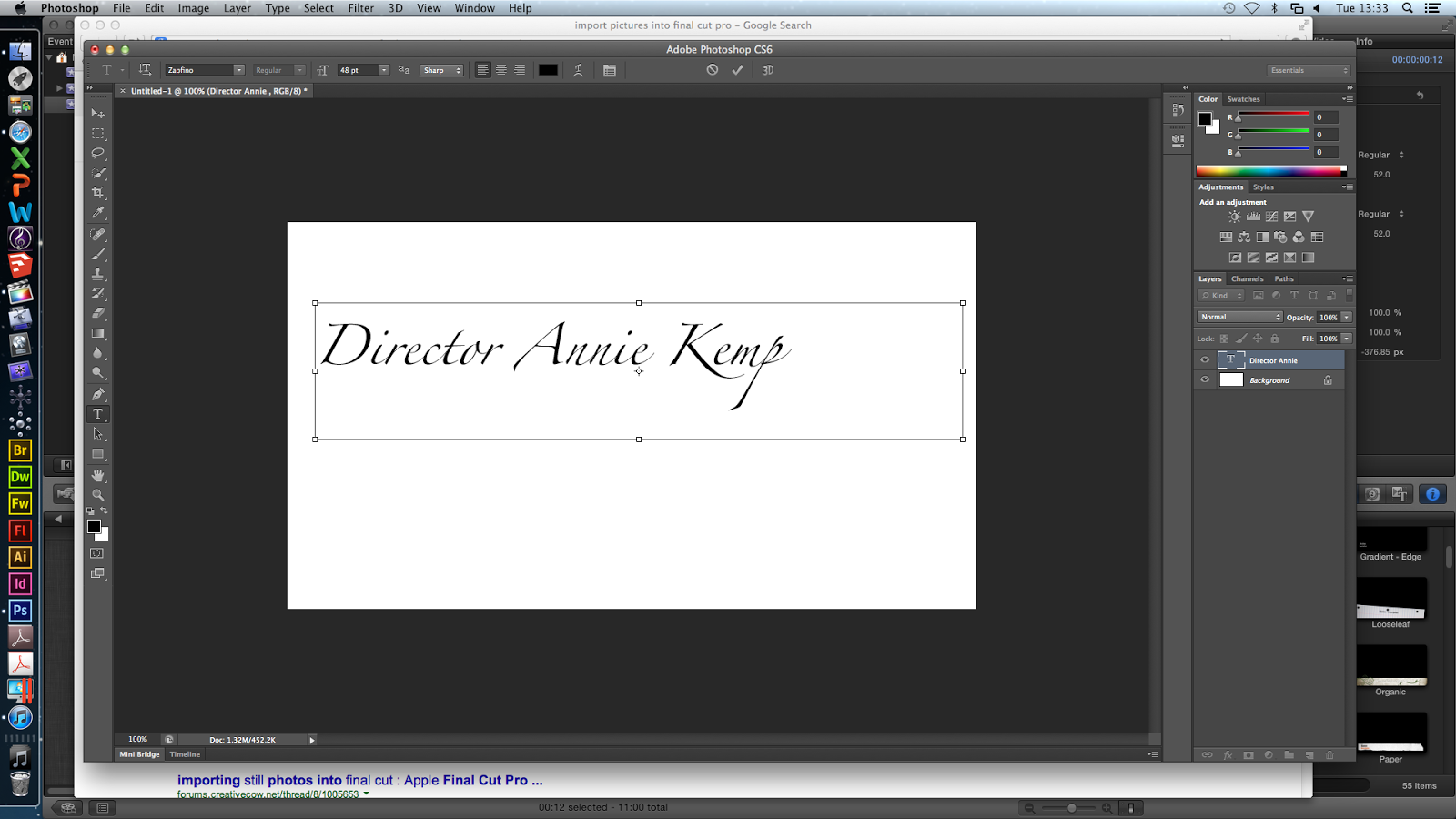
On Photoshop, I explored different fonts for the titles that will appear on the flashbacks. I liked Zapfino because it looks like handwriting and is very neat. I wrote 'Director Annie Kemp' and 'director annie kemp' to see which one I preferred. I liked the lower case title because it connotes carelessness - though the killer is a doctor, he does not focus on capitalising letters because he has more important things to be doing (killing victims).


Then I looked at Adobe Fan Heiti & Heiti, however I did not like these because they were professional-looking block letters which does not link with the plot our film opening.

Next, I looked at Chalkduster which looked like chalk written by hand. I liked this (however the chalk does not fit into the plot) so I played around with this font and added layers.
I changed the colour to red because I want the titles to be red as that connotes blood.

Then, I applied a black layer of the same writing on top of the red layer to add some depth to the red title, however I did not like this so I chose other colours for the additional layer such as brown, dark red, orange and white.


Also, I warped the text, and tested out different effects on Nanum Brush Script font which resembled handwriting:

 These were the different effects ^ and my favourite was fisheye.


After warping the text, I tried the font Zapfino and preferred this; and instead of having another layer with the same text, i wrote 'die die die'. I used the fisheye effect and changed the opacity so 'die die die' was grey and slightly faded. This places more attention on the title but still making the 'die' layer visible. This extra layer will indicate to the audience that the killer is obsessive, sadistic/blood-thirsty and therefore extremely dangerous.

Then, I played around with the fisheye for the 'die' layer:

^ This was a 100% bend and I did not like it so I chose -53% bend with a +33% horizontal distortion (below).


As well as the decrease in opacity, I blurred and slightly smudged 'die die die' to create a 'blown away' effect and this adds eeriness and mystery without taking too much attention away from the main red title.

Overall, I am pleased with how the typography turned out. I have chosen the Zapfino font in red and layer in black (however these colours will change depending on the colour of the flashback, for example if it is dark the second layer will be white). I will include different words in the second layer such as 'baby baby baby'. I want to repeat the word depending on how many letters are in the title (so 'Costume Designer Hayley Tibbs' = 'baby baby baby baby').

Tuesday, 11 March 2014

Practical Investigation: Non-Diegetic Sounds

For my practical investigation, I decided to look into using a music software called 'Logic Pro' to create some examples of non-diegetic music, with help from my friend who took GCSE Music.


For our current idea of our opening, I was thinking of where we could include non-diegetic music and if it would be effective or not. The beginning chase scene would be the most likely place for us to have diegetic music but it could work just as well if we had it quieter with diegetic sounds like heavy breathing and footsteps.

If we are going to have a lot of opening titles then sometimes it can be quite effective to have non diegetic music playing over the top as generally nothing that important happens during the opening titles. Contrary to this, in our opening we are planning to have our villain murder a pregnant girl (although not that much gore will be shown) but I like the idea of blending in the opening titles would make it more like a film opening and also less shocking, almost as if he does it everyday and it's the normal routine.

First of all, to get used to using Logic Pro, I decided to try and edit a well known tune to sound more creepy, I chose 'Frere Jacques' and played it slower than usual on the simple Grand Piano option.
I then played around with the different instruments and sound effects to create the ominous rumbling sound below and then after that merged them together, editing the timing so it sounded more sinister and creepy, I especially like the ending part as the rest of the song is building up to that moment.


My friend also played a quicker yet still kind of creepy version of Frere Jacques


The only problem is that it would be quite difficult to explain why Frere Jacques would be relevant to our film opening as it doesn't really have any links to what happens.


Friday, 27 December 2013

Actor Scouting:

Villain:


For our villain we knew the type of guy we wanted but it was quite difficult to find anyone who would be willing to participate with our filming.

Jordan (20)

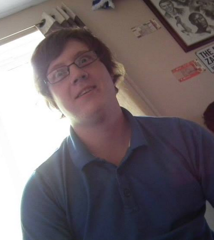
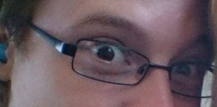
He is around the appropriate age for our villain, and although he isn't that tall we can easily change the camera angles to make him appear taller. The main feature that is ideal for our villain are his eyes, he wears either glasses or contact lenses and they look creepy at times, which would be good if we decided to have an extreme close up shot of his eyes.


Victim:

For our victim, we want someone who looks particularly feminine and yet innocent and vulnerable. They also need to be available to film and if they are around our age, they could be busy with school work etc. All of our main choices are in our school year, which is a similar age to our villain, but we decided to go with Catherine as she is slim and has long hair which is a perfect fit for our character.

Catherine (16)


 Emily (16)


 Kayleigh (16)


Tuesday, 17 December 2013

Production Company Project : Hayley

Creating our own Production Company:

As a group we had to think about creating our own production company and we decided that we would all create our own version and then see which one we liked best or include aspects of all three. As I wasn't happy with my previous examples, I decided to focus more on the typography of the lettering. I watched the YouTube video below on how to create the blood dripping effect and for the moment decided to place it onto a plain black background. After playing around with the different tools, I decided to change the aim so it was all twisted and creepy rather than the blood dropping.


This is how the typography turned out, this could be effective for my idea if I decide to have the blood dripping down the whole of the screen, to reveal these letters.


Continuing on with this simplistic idea, I added the picture to Photoshop  in the hope of adding a knife slashing sound effect. I decided the one below was simple enough and converted it into an MP3 format. I then added this into the project and made sure it was at the correct time.


The video below is the clip complete with knife sound, but it is of a very low quality and can be improved greatly. If we manage to include the blood dripping down effect in our finished product I think it would look more professional.


When using Adobe Illustrator to try out the dripping paint effect, I had a lot of trouble from the beginning, I couldn't seem to even find the simple circle tool but after a while and looking online at a lot of tutorials and help sites I managed to find my way around the program.

Following the tutorial above, I managed to create some simple red 'paint' drips which I can edit to appear more like blood, by changing the colour, and the consistency. I am then hoping to edit the text onto it to make the idea for the production company.


With the combination of mine, Raman's and Annie's ideas we are hoping to have the blood dripping down from the letters but maybe with the writing on the sink it could be effective.


Thursday, 12 December 2013

Practical Investigation of Production Company

 
In the opening for Blackout (2008), a woman has cut her wrist which we see through a close up. Then a straight cut is used to show us another close up, but of the blood dripping down the side of the white bath. A white bath is effective because the blood is made more prominent, however this would be more effective and gruesome if the audience were to see the blood dripping down the side of the bath.

This inspired us to create a production company animation where the person cuts their wrist and the blood drips down to form 'Kills Productions'. First, I applied liquid latex over my wrist so I can simply peel it off and all the make-up applied on top will come off.
Next, I applied scar wax and rolled it into long strips so when make-up and fake blood is put on it, the cut looks very deep. Then, I rubbed the outside edges to blend it in with my skin.
Then, I put black make-up in the 'cut' and in the corners where my skin met the scar wax so to create a shadow to make the cut look deeper. I applied a dark red colour on top of the black and on the scar wax around the cut to make it look bloody and wounded.

Next, I applied fake blood all over my wrist and in the cuts and let some drip down to make it look more gory and realistic. Then, I got some more fake blood and poured it down the side of a white sink, as seen in Blackout, and filmed it using a close up of my wrist then moved the camera downwards to show the blood drizzling down. This short clip will be added and edited to Annie's practical to make it look like this blood forms the words 'Kills Productions'.


Overall, I like our production company animation because it hints our slasher genre to the audience, unlike some slasher films that have production companies with misleading animations as investigated in my deconstruction post. As our opening will only be 2 minutes long, we want our audience to know they are watching a slasher film so this animation will establish that.

I began editing the clip and added sound. I chose a heavenly sound because it is parallel to this person who has bled to death. The sound is very ambiguous and denotes heaven, death, life, purity and is quite mysterious. I chose to include the sound from about 4 minutes in.


Here is the edited version with sound:


Friday, 6 December 2013

Practical Investigation of Chase Scenes

Here, Annie pretended to be the victim, so she ran past the camera which I had pointed towards the floor because when I placed it on the floor, it was too low. This low angle shot is good because it shows a different angle of the chase, thus intensifying it because the audience will be able to see many aspects to the victim trying to run away from the killer.
In this video, we used a low angle shot from the ground and Annie ran past very quickly because I thought that could be the killer's speed against the victims slower pace, making him look more powerful and agile. This will make the audience feel anxious and begin to wonder whether she gets away or not.


Next, we did a panning shot of the victim running and it is effective because we can see her speed and desperation to escape the killer. We could include a panning shot which could be framed as an establishing shot so the audience can see that she is running in a dark wooded area with branches and trees trapping her (as with the Texas Chainsaw Massacre deconstruction).


We used a low angle shot of the victim to highlight her terrified, tired and desperate expression. Also, we can hear her breathing heavily and see her looking back to highlight her anxiousness.


I decided to use an over the shoulder shot but looking over a tree. Being behind a tree highlights the number of trees and bushes in the woods, which are the victim's obstacles because they trap her in the woods. We could insert titles on the tree which would make our opening seem more professional. 


I filmed a Point of View shot from the killer chasing after the victim. This will be effective for the opening because it makes the audience feel more involved and that they are the killer who is chasing this vulnerable victim.


Another POV of the killer was filmed, but this one is of him catching the victim because she was tired and stopped to catch her breath. This, paired with intense non-diegetic music, will intensifying the catch and scare the audience because they know that he has finally caught her, and now he is going to kill her.


I filmed a high angle shot of the victim running through the woods and this makes her look smaller because she is vulnerable and weaker than the killer. Also, because she appears smaller, it makes her seem inferior to his power, almost foretelling the audience that she will get caught because he is faster and strong than her.


On our storyboard, our opening will have the camera moving into the victim's mouth while she is screaming to show that he has caught her and will be killed soon. I tried this with the victim, and did this as a POV shot from the killer so he is standing behind bushes waiting to get her. As we can see him waiting for her, this makes the audience feel helpless because they want to tell the victim not to stop running otherwise he will get her, but he does. This is effective because it makes the audience feel involved, so they will want to continue watching.


For our opening, I think we should include the low angle ground shots and the POV of the killer catching her with the camera going into her mouth. I also think we should include the high angle shot of her running because it makes her look weaker and inferior, and the panning to establish the settings and to show the audience the victim's expression.

Thursday, 5 December 2013

Practical Investigation: Photoshop Trial

Practical Investigation to look into creating an animation for our production company using Adobe Photoshop:


To create the logo and then the animation, I used Adobe Photoshop CS6, it was very confusing at first and took me ages to work out but thanks to some useful tutorials, I managed to get the hang of it and actually quite enjoyed it.

This website basically told me how to make the original logo, using all of the tools available.

http://www.rocktheshotforum.com/2012/07/20/how-to-design-a-logo-in-adobe-photoshop/

This YouTube tutorial was also extremely helpful when learning how to turn it into an actual animation, even if I had a few problems following the different layout.


As this was my first go, I wanted it to be as simple as possible so I could get the hang of it and then hopefully I can gradually make it more and more complex as I learn my way around the program. The end result isn't as good as the real thing will be but it has given me an idea of how to make it successfully.

Logo:


I started off by making the background by choosing the gradient option with the colours red and black, I decided to make it diagonal so I could put the text in with different colours.
I then inserted the words 'KILLS' and 'PRODUCTIONS', choosing the 'Chiller' font as I felt it was quite creepy and would fit our genre well. I made the 'KILLS' slightly bigger and also put it in red, with the connotation of blood., so it would stand out against the black.


I ended up with the image below as the final result for my practise logo. I can already see how I can improve on this, making the background more interesting for example and maybe changing something with the words themselves.

Animation:

After watching the video above and attempting to dive straight in making it as interesting as possible before realising how difficult it would be, I decided to start off by simply moving the word 'KILLS' along to the right, even this in itself was quite confusing for me with no previous experience. 

First I had to duplicate the frame, making sure the timing setting was on no delay (0 sec.), I then moved the text box along to the right, trying to keep it in line with where it was before. 


I then had to add a 'tween' motion between the two selected layers, I decided to add 40 frames in the hope that it would be quite fast. 


As you can see from below it didn't really turn out that well, the movement was quite jumpy meaning I need to add more frames to make it more smoother.


I change the amount of frames in between the two layers to 100 to hopefully improve the speed and flow of the text. I also changed the end position so it looked more impressive, but as I'm moving the end destination further away I should have taken that into consideration when choosing the amount of frames to include. However I feel this isn't disastrous for a first attempt and I feel like I should be able to make it much better with time and practise.


Practical Investigation: Chase Scene (2)

Practical Investigation of a Chase Scene:

This was already Raman's Practical Investigation (and you can see it here) but one day after school, I happened to be staying after school and I had some really good ideas so I tried it out with my friend Catherine. Overall I felt that some of the angles were good but the lighting wasn't that good as it started to get dark quite quickly although in some of them it does look effective. If doing this again, I would definitely do it earlier in the day to get better lighting and I would also use a better camera as I recorded it on my phone, which doesn't have a high quality camera. I do however think it gave me a good idea of what to do in our final piece and what camera angles/movement would be successful.

When uploading the videos to YouTube, I chose to automatically enhance the lighting and stability issues, in some of them I think it has improved it so I decided to keep it in.


It's hard to tell from the lighting but this was in the wooded area, I'm not too sure about the darkness, I think it looks unprofessional and you can't see her running properly but on the other hand I like that fact that she suddenly appears in the light and you don't really see her coming. Although the attempt at a tracking shot didn't work that well, I think the idea of making her wear her white shirt shows up well on the video and in the darkness.


This is probably my favourite video out of the selection because I like the colour of the sky and that fact that she is silhouetted as she jumps. I also like the low camera angle used as I think it is an interesting variation from the typical angles. It also makes the gate seem higher and therefore her desperation to get away even harder. As she runs for a bit at the end, I think it would be better to either trim it down or to have the villain follow her in (but fast walking, I don't think he would run), showing that by having to jump up and then down, it has made him catch up with her.


I thought that originally this clip was one of the better ones, but the editing automatically done by YouTube has made it seem more disorientated, almost resembling her dizziness as she jumps off the gate. Obviously if we used this type of match on action shot we would have to make sure the movements she did were exactly the same for both angles, as for this one she gets stuck on the gate at one point and almost falls over.


With this one, obviously the lighting was major issue and the editing has just made it even more difficult to see the subject, however I do like the end result of the villain closing in on the victim and moving the camera right into her hair. That idea we could replicate wherever the location if we are choosing to have him capture her in such a way, this shot could easily be replicated up against a tree or a wall.


This one was okay, I liked the white of the shirt again and I felt it stood out more when she grabbed the tree, if we did decide to do this type of shot then I feel it would be more effective to have the villain follow her in almost the exact same place. We could also put more focus into the tree and have different angles but having the trees to be almost the main focus.


This angle didn't really work, the light was too dark and the subject goes by extremely quickly, however if filmed correctly with the ideal conditions, I could see that this angle would be effective, in particular for our film opening as we are hoping to have it fast paced, to show how urgent she is to get away from the killer.


Again, the editing made the film even darker than it was originally but I don't think it changed it too much. I like the idea of filming through a metal fence with the subject extremely close as it represents the target being so close but yet there is a barrier in the way. I think that this angle was quite effective but in our opening, I'm not sure if we are going to have a fence in the area or if it will just be trees but the same effect can still be applied.


The auto-fixing that YouTube did make it almost impossible to see her so this is one which I think did not improve and instead reduced the quality. It was quite quick as well and I don't think a small side angle of her running would fit in well with the ideas for our opening.

Friday, 29 November 2013

Practical Investigation: Victim and Villains Clothing

Villain:

~ For our villain, I think it would be important to have a costume that either we already own, can be made easily or is relatively cheap. At the same time it has to be relevant to our character so the audience can understand that they are the villain. At the moment, our villain is an adult male, somewhere in his twenties or thirties and his main victims are young teenage girls, who become pregnant when underage. I liked the idea of our villain being simply dressed in something completely inappropriate, such as a pristine suit. This would be confusing as not many serial killers would wear a suit whilst murdering their victims. 


~ We could even take it a step further and make him wear a tuxedo or a groom's wedding suit, maybe hinting that he was jilted or his wife died suddenly. If we did decide to do this however, we would possibly have to make sure that the reason for his inappropriate outfit was explained during the two minute opening as we wouldn't want to confuse the audience. 


~ Similar to the ideas above, I also liked the idea of our villain wearing a police uniform. This would be juxtaposition as well with the idea of good vs bad, police vs criminals. Again, if we chose this option we would have to explain why he would be wearing it, maybe in the past he was a police officer but something happened so he had to change jobs or he saw something that changed him mentally. 


~ We are currently thinking of including a scene in our opening where the villain cuts into the victim, almost like a cesarean and then we had the idea of dressing our villain in something related to a hospital, as that would be related to the character but creepy at the same time. If choosing this option, then we could also include a surgical mask that are normally worn by dentists although nurses wear them as well, this could have negative effects on our audience and maybe bring up bad memories. 


 Victim:

~ If we did decide to go with the underage pregnancy/prostitute obsession then as our villain's targets are so specific, they would all be wearing very similar clothing. Our victim would be wearing very revealing clothing, depending on the time of weather, but if we choose to set it in winter, then it would be more obvious to the audience that she was a prostitute as she wouldn't choose to go out in revealing clothing in the freezing cold weather. If we definitely go with the pregnant idea, then we would have to make sure the top would be loose enough for the victim to have a 'baby bump' but still cling to her body. I think our victim should almost definitely be wearing a short skirt, to exaggerate her femininity and her attempt to show off as much of her body as she can. Below are some of the outfits I could imagine some of our victims wearing, although it depends on how far into the pregnancy he takes them, but these photos give a general idea. Obviously the summer-y aspects would need to be changed, they might not be as colourful or pretty but in terms of size I think they are accurate.