Showing posts with label Titles. Show all posts

Thursday, 6 February 2014

Editing Opening Titles:

For our opening titles, our original idea was to have the titles placed in between the flashback clips so I looked at creating a 'template' title that we could edit with the names.

On Final Cut Pro, I looked at the existing templates for titles and liked "Ink" and "Splash - Ink Splats" as I thought the ink could remind the audience of blood, if I changed the colour and edited it slightly.


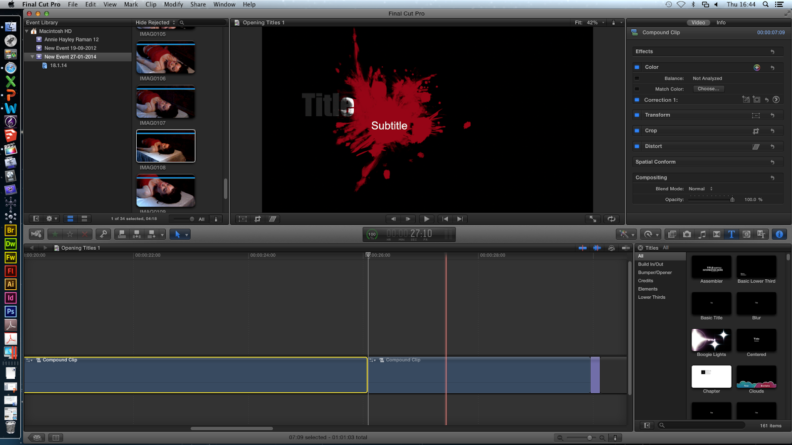
I chose "Splash - Ink Splats" as I prefer how it dripped down before splashing. I changed the colour so it resembled blood and trimmed the clip so it was only a couple of seconds long.


I then disregarded the option of a subtitle as I was only using the actors name but if we decided to use this with all the other names such as 'Director' then we could use the subtitle as well. As the background was black I decided to go with a white font as a contrast, with the  "Bank Gothic" font as I liked the style.


I then switched back to the original white/grey background which meant the font had to be changed to black which I didn't think looked as effective with the letters that were in the ink itself and the font I had chosen.


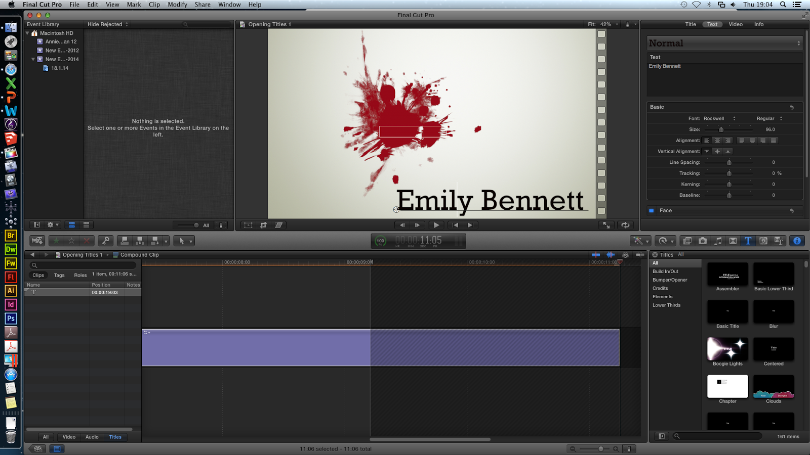
Therefore I had to move the writing to the bottom right of the screen as there was more space and I thought it would look effective. I also changed the font again and chose a few that I thought would look better.


The next font was similar to a type writer and I liked the look of it but I felt it didn't suit our genre and the style of our film opening.

#


I decided to go with the font shown on the right as I liked the fact the capital letter were enlarged more than the rest of the word. I made sure it would look good when the ink ran down before splashing as it only appears at the very end.

I wanted to add a sound to the title, just to stop it from being completely silent and if we wanted them to come up quickly between the different flashback clips then a quick sound would help add to that effect. I looked into a number of different sounds that would have some relation to the horror theme and finally settled on the one below and when I added it to the current clip, I timed it with the blood splashing.


This is the final result of the first draft.


I then decided to edit it further by changing some of the elements I used. I removed the white background as I thought having no background at all (and therefore completely black) would make it more conventional to a horror/slasher film. It also makes the blood stand out more but this meant I had to change the font colour back to white again, but I dimmed it slightly by making it more grey so it doesn't seem as bright.

I also decided to move the position of the writing to the top right corner which meant as the blood drip runs down, the writing moves up, I liked this effect but I wasn't sure if it would fit our genre well. I decided to change the sound as well and chose a 'blood spatter' sound effect that I also found on YouTube, which I found to be more gruesome and gory, similarly to the first one I timed it with the splashing of the blood at the end.


This is the second draft, with the changes mentioned above.


After editing the two versions of the credits and showing them to my friends, I prefer the second one as the sound is more related to a slasher movie and I like the way the name comes up onto the screen. However I feel that it is a bit basic and I'm not sure whether my group were looking for something more sophisticated or not. We are also not sure whether to have the credits onto the actual footage to save us some time as having the credits separately will mean we will lose more time on the storyline itself.

However, if we do decide to choose that option, there are elements of these titles, that I can incorporate into the new credits such as the blood splatter. There is also the option of having the credits when he is writing in his diary as the white background of the first one could resemble paper and I think the blood drips would look effective in that case.

Thursday, 12 December 2013

Deconstructions of Existing Professional Production Companies for Slasher/Horror

Evil Dead
TriStar Production Company is represented by a horse that enters the screen through a god-like strobe of light around clouds which gives us a heavenly image. This does not fit in with the slasher genre of Evil Dead and seems quite misleading, so for our opening we should have a production company which hints to the audience what our genre is.

The next production company for Evil Dead is Film District and the camera moves down the sides of buildings then tilts upwards where Film District fades in an establishing shot of the buildings. This gives off an action genre, again, not Evil Dead's slasher genre.


Ghost House Pictures is the next production company for Evil Dead and this is more suitable to its genre because it shows a close-up of a doorknob and the door closing by itself which is scary because this has a supernatural element to it. Then, a skull appears in the keyhole - skulls symbolising death and disease. Also, the dark colours and low key lighting create a gloomy atmosphere. This is a better production company because it hints the genre to the audience, including the name.


American Mary
The first production company is Industry Works and has an image of a factory on a hill surrounded by clouds. Industry Works is 'wiped' on the hill and looks metallic, then each letter flashes light as if light has been passed over it. This bring attention to the name, especially as it is against a black backdrop. This fits in well with American Mary's slasher genre because it is dark and sinister looking.


The next production company is tt and this, like Industry Works, is against a black background which makes the name look more mysterious. However, a 'sun' rises behind the name which then subverts the previous mysteriousness theme and makes it seem playful and happy. This makes the production company seem versatile - that it can produce films of different genres. We would not have a flexible production company animation because our opening is only 2 minutes so we want to suggest our slasher genre as much as possible.


The Crazies
Overture is the first production company for The Crazies and it begins with a strip of blue shining over and across the name, which then illuminates for the audience to see properly. 'Films' then appears underneath, and shortly after 'a STARZ company'. To me, this seems quite cluttered because more words keep coming up when I believe that it should just be the name so it looks neater and more professional. So, for our production company we will include only the name, no other words.


Next, Participant Media appeared through a series of vertical multi-coloured lights and then the letters are pulled together from left and right. Once only the name is showing, fire blazes the screen which washes out the name and this fire is part of the opening of The Crazies so incorporating the opening with the production company looks interesting and professional.


Boogeyman 3
Stage 6 is the first production company and the logo is already on the screen. It keeps moving up and down slightly as if shown in an old cinema, then the background repeatedly changes to white and 'Films' appears. This does not indicate what type of genres Stage 6 caters for which is beneficial because, again, it shows its versatility.


Ghost House Pictures produces this film as well which proves that it is suitable for slasher and horror films. Also, it proves that it is a trusted company because they make popular films.
The production company name is shown again and this exits the screen when the camera is panning across a wall. This effect, as with The Crazies, makes the opening seem more professional and continuous because they are both smoothly incorporated.
For our production company, we should indicate to the audience what the genre is so they have a better understanding of our opening. Also, it must be quite simple with not a lot happening so to keep the audience engaged and not to confuse them. In addition, we should incorporate the opening with the production company animation as it looks better and more professional.

Friday, 22 November 2013

Deconstruction of the Timing of Titles & Typography

Haunting in Connecticut:
 - fading is used to transition from picture to picture
 - straight cuts for sequences of operation (scissors, dead mans head)
 - as music becomes more out of tune and higher, zooming to show diff pics changes to flashes with camera shutter sounds, some straight cuts still used
 - different pictures of people with dead bodies are shown almost every second (I have not included all in the timeline), this makes the audience question who these people are and how they died
 - common font Bradley Hand as used for some of the titles - this makes it seem quite unprofessional because the font should have been more unique

ADD TIMELINE PIC

Se7en:
 - many titles used, the font looked like informal handwriting which fits in with the diary (which is also shown in the opening)
 - we should have our titles in handwriting typography because we also have a diary in our film opening
 - the titles came on in flashes and moved around so to create a fast and more dramatic pace to a simple opening title scene
 - short sequences of what the killer does (e.g. shaving off fringerprints, crossing out particular words - similar to ours) gives an insight into how obsessed the killer is, and this intrigues the audience.

ADD PIC

Insidious: (as mentioned in previous post http://www.anniehayleyraman.blogspot.co.uk/2013/09/film-opening-title-deconstruction.html )
 - also has many titles, the typography is in capitals and the title Insidious is in bold to make it look more dramatic and sinister. Also, it is in red which symbolises danger and blood, and ironically love and lust.
 - with the titles, scenes of the house are shown and are in balck and white which create an eerie atmosphere which scares the audience because it gives off a haunted feel

ADD PIC

Overall, for our final project we could include pictures which we zoom into to highlight aspects to the audience, as in Haunting in Connecticut, because that will emphaisise the killer's obsession with death and pregnant women. Also, we could incorporate the titles so they are over these pictures and scenes, as in Se7en and Insidious, and we could have some of the pictures in black and white as this is eerie. The timing of the titles should be that we have the main production companies at the beginning then the title of the film right at the end, with dramatic music - inspired by Haunting in Connecticut because that film opening was very disturbing which is what our group is aiming for, as it is a slasher.

Monday, 30 September 2013

Film Opening Titles Deconstruction:

Deconstruction of the opening titles of The Perks Of Being A Wallflower:

~ For my opening titles deconstruction, I decided to look at The Perks Of Being A Wallflower, as I knew this film had a lot of opening credits that I could look at. Then I put the screenshots onto a timeline with the time that the text came up and what it meant.
0:00 - 0:45
0:45 - 01:17
0:17 - 01:45
The 10 minutes clip that I used is below.


Sunday, 29 September 2013

Film Opening Titles Deconstruction of "Seven"

Se7en 
Above shows my opening titles deconstruction of the movie- "Se7en". Opening titles are the series of names that appear on the screen at the beginning of the movie, including the production company, leading actors, supporting actors, the title of the film itself, and many other things. This deconstruction, along with the other two from the two other members in this group, will give us a good idea of placement of opening titles when designing, planning, filming and finally editing our final coursework.

Saturday, 28 September 2013

Film Opening Title Deconstruction

RAMAN:

For this piece of work, we had to deconstruct a film's opening titles. I chose to deconstruct Insidious' opening because there were many titles. Each title had a background picture of a different place in a house, all in black and white and this makes you think of ghosts. Ghost hauntings and supernatural elements are some typical horror conventions which are added to scare the audience. Also, at 2:33 there is a shadow of somebody standing in the room but we cannot see their face - this could be either a person or a ghost. Anonymity is another horror convention, killers often cover their faces or attack in the dark so you can't see them and this oblivion frightens the audience. Then at 3:14, you see footprints which appear then disappear along the floor and this, again, makes you think that there is a ghost haunting the house.