Showing posts with label Typography. Show all posts

Friday, 4 April 2014

Final Editing (Typography & Sound)

From receiving feedback from our first draft, there was a comment on the timing of the titles because I had placed them on flashbacks which meant they appeared for less than 2 seconds. This made the title difficult to read as well as distracting the audience from the flashback which resulted in the audience missing it all. So, I moved all the quick titles onto longer clips so the audience can read them better.
Also, the red A+E sign between the chase scene and death scene was, according the audience, not needed to I got rid of that.


Next, Annie and I worked on the sound and we chose a different scream. I preferred number 7 0:28 because the girl screams and, at the end, chokes a little which fits in with our opening because the victim is being strangled.


Monday, 31 March 2014

Typography (cont)

 From the previous titles I had made & put into Final Cut Pro, I received feedback that the title was difficult to read because it was read and the 'shadow' text was easier to read because it was white and stood out against the dark background. I tried inverting it but that did not work because the 'die' layer was rasterized.


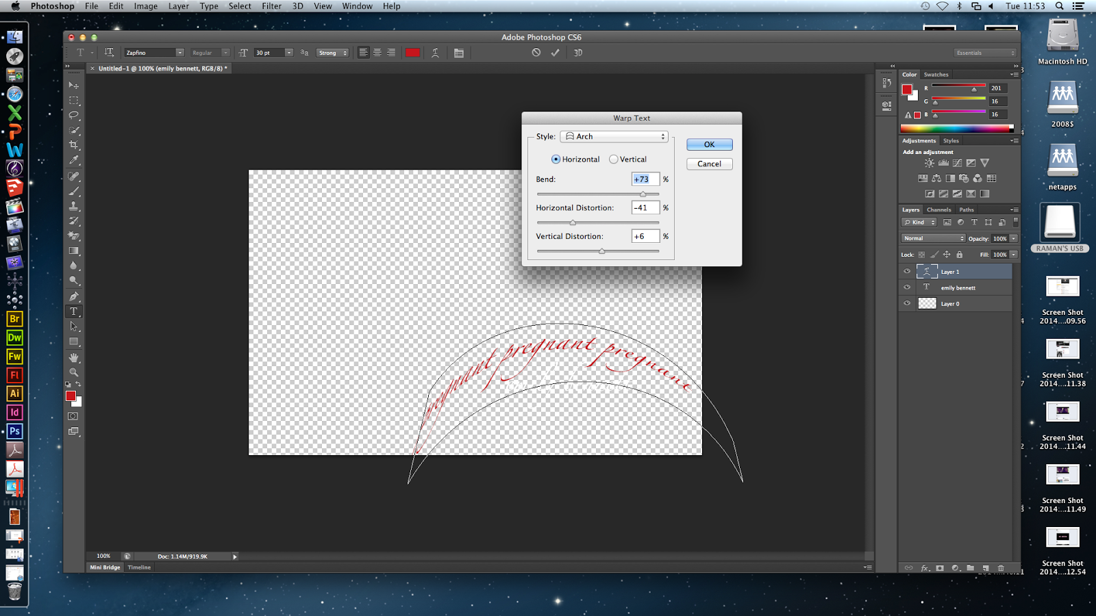
I changed the colours so the shadow text is red and the main title is white. I applied the arch warp on the words 'pregnant' going around actor Emily's name so the audience know she is pregnant as that is not made clear in the film opening because it would be something the audience discover later.

Next, I inserted the words 'strangle' on another title and used the inflate warp to expand it from one side. I like distorting the 'shadow' titles because its imbalance contrasting the straight main title represents the killer's thinking - he is a doctor so is clever and logical, but he is a killer with sick, twisted thoughts.
I duplicated the strangle layer and changed the colour to a darker red to add depth.
In the flashbacks where I made the last second change colour/saturation, I made a title which will flash up over the effect. Fisheye warp was applied to the title so it is enlarged and distorted. The title says foetus so the audience get a quick clue as to what the killer is taking out of the victim.

I inserted more titles which say
  • 'prostitute' (flag warp)

  • 'scream' (flag warp)

  • 'suffer' (inflate warp)
  • 2 'bloodthirsty' (fish warp and wrap around the actor's name)
  • 'hideout' (twist warp)

Thursday, 27 March 2014

A+E on Photoshop (Raman's Image & Blessing's Gif)


My group and I wanted an A+E title to appear in the fade out after the chase to make the opening seem more professional because the name of the film usually appears after something dramatic happens at the beginning.
 I found a picture of a hospital red cross sign and wanted that to be and + sign for A+E because we wanted the audience to believe A+E involved a hospital when it actually meant Adore + Endure. Also, from a hospital A+E our audience will be able to guess the killer is a doctor.
I typed A and E next to the plus sign and made it bold and added shadows and glows to the letters and sign from the Layer Style box.
I wanted to blur the harsh lines between the + and letters so used the blur tool. The blur tool did blur it but not a significant amount due to the shadow I had put around both the letters.
I put this into Final Cut Pro but it did not look very good. So I tried again but made it more simple and wrote A+E and blurred the edges using the Layer box again.

Again, this did not work and we received feedback that it did not look good so I got rid of it from the sequence.

Blessing, who knows a lot about Photoshop, made a moving image of the words 'Adore + Endure' being highlighted so the audience can read it better as before the words were unclear. Blessing darkened the words layer by layer and put the layers together in a moving sequence. This was then added to Final Cut Pro and this gif and darkened layers are shown below.


Thursday, 13 March 2014

Typography on Photoshop

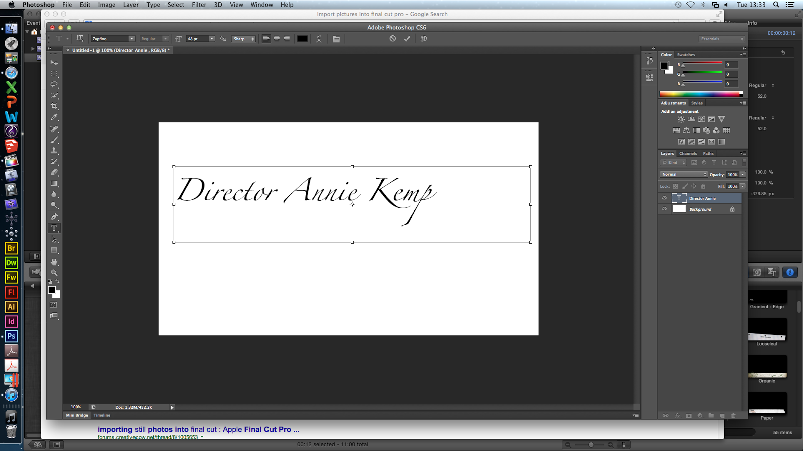
On Photoshop, I explored different fonts for the titles that will appear on the flashbacks. I liked Zapfino because it looks like handwriting and is very neat. I wrote 'Director Annie Kemp' and 'director annie kemp' to see which one I preferred. I liked the lower case title because it connotes carelessness - though the killer is a doctor, he does not focus on capitalising letters because he has more important things to be doing (killing victims).


Then I looked at Adobe Fan Heiti & Heiti, however I did not like these because they were professional-looking block letters which does not link with the plot our film opening.

Next, I looked at Chalkduster which looked like chalk written by hand. I liked this (however the chalk does not fit into the plot) so I played around with this font and added layers.
I changed the colour to red because I want the titles to be red as that connotes blood.

Then, I applied a black layer of the same writing on top of the red layer to add some depth to the red title, however I did not like this so I chose other colours for the additional layer such as brown, dark red, orange and white.


Also, I warped the text, and tested out different effects on Nanum Brush Script font which resembled handwriting:

 These were the different effects ^ and my favourite was fisheye.


After warping the text, I tried the font Zapfino and preferred this; and instead of having another layer with the same text, i wrote 'die die die'. I used the fisheye effect and changed the opacity so 'die die die' was grey and slightly faded. This places more attention on the title but still making the 'die' layer visible. This extra layer will indicate to the audience that the killer is obsessive, sadistic/blood-thirsty and therefore extremely dangerous.

Then, I played around with the fisheye for the 'die' layer:

^ This was a 100% bend and I did not like it so I chose -53% bend with a +33% horizontal distortion (below).


As well as the decrease in opacity, I blurred and slightly smudged 'die die die' to create a 'blown away' effect and this adds eeriness and mystery without taking too much attention away from the main red title.

Overall, I am pleased with how the typography turned out. I have chosen the Zapfino font in red and layer in black (however these colours will change depending on the colour of the flashback, for example if it is dark the second layer will be white). I will include different words in the second layer such as 'baby baby baby'. I want to repeat the word depending on how many letters are in the title (so 'Costume Designer Hayley Tibbs' = 'baby baby baby baby').

Thursday, 6 March 2014

Creating the Title for the Blog- Linked to the Typography and Name of our Film Opening

As part of finishing the filming process of this project, I felt that it would would be a good idea to quickly make the Title to our blog more suited to our film opening.
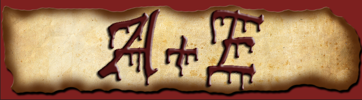
To do this, I wanted to incorporate my idea of the dripping blood that I had originally had for our production company.
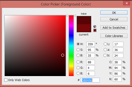

So with this idea, I went into Photoshop, naming the document "Title, and initially coloured the screen a blood red.
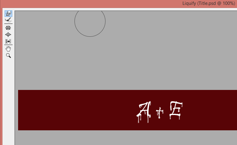
Using the text tool, I added the letters "A + E", white in colouring, and then used the "liquefy" filter to create the dripping blood effect, producing the image shown below:


At this point, I decided to save the piece that I had created as an image, using the JPEG file type.




Not really liking the look of it, I tried out a variety of different background colourings, of which you can see to the right. However, I still felt that it looked too plain and one dimensional.
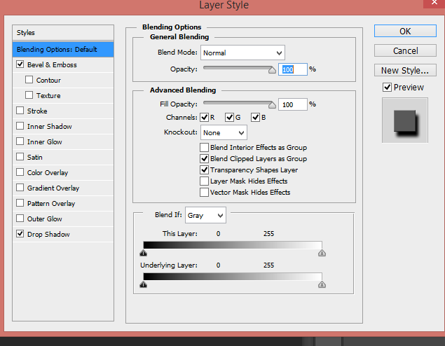


To add more depth to the "blood" writing, I used the Layer Style tool, to make it look more 3D, adding shadow and tones. This really brought the image to life a bit more, but it still needed something else added to it.


To resolve this, I decided to add a burnt paper effect, using an "old paper" image that I found online, editing it to make it look burnt, and placing it behind the words, changing the "A + E" to a red blood colour.


You can see the result of this to the left and right. Liking this, I saved what I had made as a photo prototype of the finished title.


Wanting to see what this looked like as the title, I uploaded it to the blog, a screen shot shown above. On conversing with Raman and Hayley, Raman suggested that I added to it, making it look like part of the killers diary by putting a diary entry behind the "A+E".
And so, I added the text into the background, reducing the intensity of the black writing to emphasise the "A+E", and riding the text on the title using the rubber tool.

Below shows the screen shot of the final title of the blog, and what it looks like now: