As part of finishing the filming process of this project, I felt that it would would be a good idea to quickly make the Title to our blog more suited to our film opening.
To do this, I wanted to incorporate my idea of the dripping blood that I had originally had for our production company.
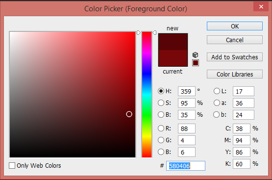
So with this idea, I went into Photoshop, naming the document "Title, and initially coloured the screen a blood red.
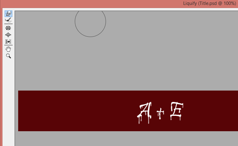
Using the text tool, I added the letters "A + E", white in colouring, and then used the "liquefy" filter to create the dripping blood effect, producing the image shown below:


At this point, I decided to save the piece that I had created as an image, using the JPEG file type.


Not really liking the look of it, I tried out a variety of different background colourings, of which you can see to the right. However, I still felt that it looked too plain and one dimensional.
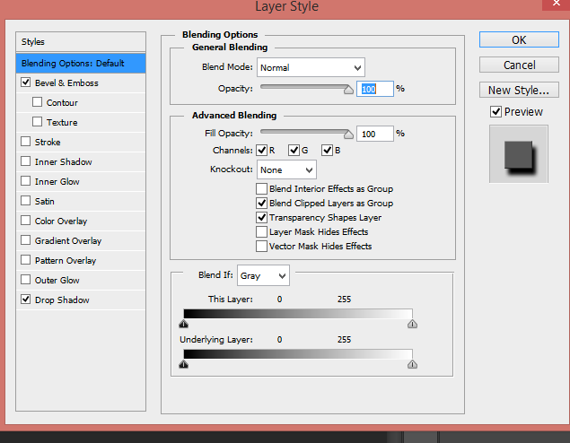
To add more depth to the "blood" writing, I used the Layer Style tool, to make it look more 3D, adding shadow and tones. This really brought the image to life a bit more, but it still needed something else added to it.

To resolve this, I decided to add a burnt paper effect, using an "old paper" image that I found online, editing it to make it look burnt, and placing it behind the words, changing the "A + E" to a red blood colour.

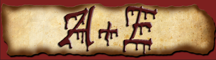
You can see the result of this to the left and right. Liking this, I saved what I had made as a photo prototype of the finished title.
Wanting to see what this looked like as the title, I uploaded it to the blog, a screen shot shown above. On conversing with Raman and Hayley, Raman suggested that I added to it, making it look like part of the killers diary by putting a diary entry behind the "A+E".
And so, I added the text into the background, reducing the intensity of the black writing to emphasise the "A+E", and riding the text on the title using the rubber tool.
Below shows the screen shot of the final title of the blog, and what it looks like now:


No comments:
Post a Comment