From the
previous titles I had made & put into Final Cut Pro, I received feedback that the title was difficult to read because it was read and the 'shadow' text was easier to read because it was white and stood out against the dark background. I tried inverting it but that did not work because the 'die' layer was rasterized.
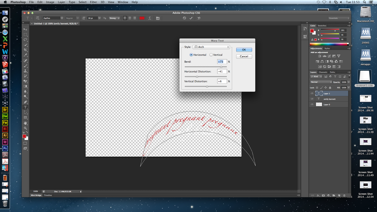
I changed the colours so the shadow text is red and the main title is white. I applied the arch warp on the words 'pregnant' going around actor Emily's name so the audience know she is pregnant as that is not made clear in the film opening because it would be something the audience discover later.
Next, I inserted the words 'strangle' on another title and used the inflate warp to expand it from one side. I like distorting the 'shadow' titles because its imbalance contrasting the straight main title represents the killer's thinking - he is a doctor so is clever and logical, but he is a killer with sick, twisted thoughts.
I duplicated the strangle layer and changed the colour to a darker red to add depth.
In the flashbacks where I made the last second change colour/saturation, I made a title which will flash up over the effect. Fisheye warp was applied to the title so it is enlarged and distorted. The title says foetus so the audience get a quick clue as to what the killer is taking out of the victim.
I inserted more titles which say
- 2 'bloodthirsty' (fish warp and wrap around the actor's name)


No comments:
Post a Comment