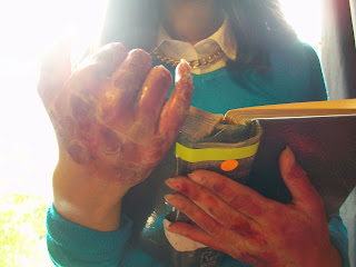
This was my other hand and this was made to look bruised and bloody. The palm of my hand was covered in fake blood to make it look like I had just killed someone, and the back of my hand had scars, blood and bruises on it.
Both of these hands could potentially be what the killer's hands look like. The burnt hand was the most gruesome judging from other people's reactions so we could make both of his hands look burnt. However, if so, then we would have to bring the element of fire into how the killer kills his victims. From my research on victim's bodies I found the convention of slasher films was that most were left bloody so the scarred and bloodied hand could be used for our final project.
Back lighting was used here, and a close up of the book and hands and this works well because it put emphasis on what the hands look like. If we were to insert photographs in the book then the back lighting would highlight those too.
Front lighting and a close up of the hands and diary, again, accentuates the state of the killer's hands but using a front angle of the book, it could also highlight a few words (if the words were made more prominent). Also, the photos would be made visible from the lighting however, because the angle is looking down on the book, the photo would be upside down, so we could only use this lighting for emphasis of his hands.
This is a mid shot using back lighting. The back lighting makes the killer look angelic and because they are holding the book as if it were a Bible, this gives off a religious sense. This is similar to the research I did on the victim's bodies, where the security guard has been hung high, was given wings and using back lighting, this all made him resemble an angel.
Here, low key lighting was used and this creates an eerie atmosphere. It is dark, like the killer himself and darkness is a typical horror and slasher convention to use for villains and killers. Low key lighting does not make his hands or the diary particularly visible so using low key lighting when shooting the hands and diary would not be beneficial.
High key lighting was used here and this emphasizes the state of the killer's hands and if the title was put on the front, it would make that visible too.

Natural lighting is used to show the 'true beauty' of something, and in this case, there is nothing beautiful about the killer, his hands or the diary. So, if we were to use natural lighting to show the hands and diary, (and use the angel angle and lighting) it would be very ironic. Contrasting and irony of the representation of a villain/killer is a common convention used in slasher and horror films to make the killer seem more devilish.
Here is a close up of killer's hands and they are pointing to a word. Using a close up does not make the word visible but it would make a photo visible. So, we could use a close up when the killer is looking a photographs of his victims.Here are two extreme close ups of the diary and (this is not the diary we are going to use in our project) the fingers are pointing to the sentence "To laugh among mourners; to laugh at a funeral." A convention in slasher films is that the killer is very sadistic and enjoys killing people, for example Jason from Friday 13th and Freddy from Nightmare on Elm Street. So for the killer here to be pointing at that, and using an extreme close up to show the audience as well, highlights his love/obsession for killing.
The extreme close up here us even more closer than the one above and really highlights the words. Here it says "How wonderful is Death, Death and his brother Sleep." Personifying death and sleep is very strange and quite terrifying, and often killer's (in films and real life) are mentally unstable and believe death is an actual person controlling them.
Here is a high angle shot of the killer looking at the diary and they are pointing to words, but the audience cannot see them, similar to close up shots of the diary. This high angle shot could be used to show the audience the state of the old diary and the photos of victims. Also, from this angle, if he were to brush his fingers over the diary and photos in an adoring manner then that would make him seem even more disturbing.
Here is a mid shot of the killer looking at the diary. This is similar to the other midshot in that the killer looks serene and priest-like in the way they are holding the diary like a Bible.
Here are two point of view shots of the killer's arm. Here you can see the diary and hands clearly and this angle is good because it makes the audience feel involved - it makes them feel like they are the killer. This may make them feel helpless because the audience do not want to kill people, but using this POV (especially when attacking their victims) will make it seem like they are killing people.


No comments:
Post a Comment