Showing posts with label Practical. Show all posts

Thursday, 20 March 2014

Death Scene Non-Diegetic Sound Creation

For our film opening, now that we have almost finished the visual side of editing, we now need to think about the audio, diegetic and non-diegetic sounds. I decided that, for the death scene, I wanted to create some music, similar to that of Se7en and American Horror Story's non-diegetic sounds to play throughout the scene. To do this, I needed to find a form of software that would easily allow me to create good quality music with little training needed before hand- something key for this to work, as I initially had no previous experience with sound creation software.

In the end, my friend recommended Garage Band, a software already installed on the Mac's at school, to use for this particular project.


Using this YouTube tutorial as a guide of how to use Garage Band, I started the process of creating my own composition for the death scene, relating to my research on non-diegetic sound that I have previously done, and making sure that it is appropriate to the visual stimulus that the audience will get- linking it to the footage.

Initially, I tried creating the non-diegetic music from scratch- not referencing the two sounds that I had taken inspiration from, including Se7en and American Horror Story's sounds. This, however, as shown below, turned out very badly, producing a randomly spread set of sounds that didn't work together to create the desired effect.


To solve this problem, after quite a few hours of work, I scrapped what I had done, regarding it as a trial practice. I needed to do this in order to re-focus the sound I was creating, and make a good quality piece rather than a mediocre one.

Wanting to take inspiration specifically from Se7en's non-diegetic sound, I insert the downloaded soundtrack onto  the GarageBand timeline. This, I decided, I would try and copy with my own sounds, and then manipulate to be more appropriate to our footage, and more original- not sounding like a "copy" of the original.


Using Free FX, a website that I found that allows users to download sound effects for free, I started playing around with the music that I had a my disposal, trying to re-create Se7en's sound but changing it slightly to be original and appropriate to our footage.

At this point, initial point, this is what I had created:


Now that I have created my initial sound, of which is shown in the audio clip above, I need to "tweak" it and finish it so that it matches the audio. This, however, I cannot do this until the footage is completely edited- so that the audio is exactly how we want it. At this point, I now need to re-focus on the footage again, perfecting the video so that I can then perfect the audio.

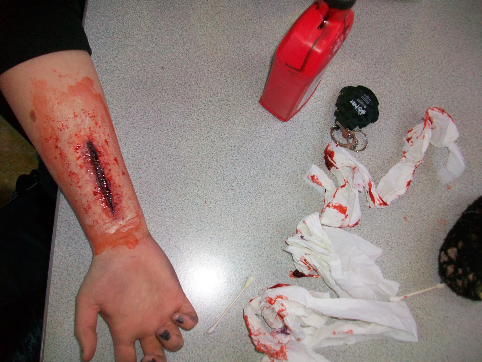
This being said, I am pleased with the non-diegetic sound that I have made so far, it linking both to my inspirations- Se7en and American Horror Story's non-diegetic sounds- and the content of our film openings visual stimulus- the gore, blood, etc.

Thursday, 13 March 2014

Typography on Photoshop

On Photoshop, I explored different fonts for the titles that will appear on the flashbacks. I liked Zapfino because it looks like handwriting and is very neat. I wrote 'Director Annie Kemp' and 'director annie kemp' to see which one I preferred. I liked the lower case title because it connotes carelessness - though the killer is a doctor, he does not focus on capitalising letters because he has more important things to be doing (killing victims).


Then I looked at Adobe Fan Heiti & Heiti, however I did not like these because they were professional-looking block letters which does not link with the plot our film opening.

Next, I looked at Chalkduster which looked like chalk written by hand. I liked this (however the chalk does not fit into the plot) so I played around with this font and added layers.
I changed the colour to red because I want the titles to be red as that connotes blood.

Then, I applied a black layer of the same writing on top of the red layer to add some depth to the red title, however I did not like this so I chose other colours for the additional layer such as brown, dark red, orange and white.


Also, I warped the text, and tested out different effects on Nanum Brush Script font which resembled handwriting:

 These were the different effects ^ and my favourite was fisheye.


After warping the text, I tried the font Zapfino and preferred this; and instead of having another layer with the same text, i wrote 'die die die'. I used the fisheye effect and changed the opacity so 'die die die' was grey and slightly faded. This places more attention on the title but still making the 'die' layer visible. This extra layer will indicate to the audience that the killer is obsessive, sadistic/blood-thirsty and therefore extremely dangerous.

Then, I played around with the fisheye for the 'die' layer:

^ This was a 100% bend and I did not like it so I chose -53% bend with a +33% horizontal distortion (below).


As well as the decrease in opacity, I blurred and slightly smudged 'die die die' to create a 'blown away' effect and this adds eeriness and mystery without taking too much attention away from the main red title.

Overall, I am pleased with how the typography turned out. I have chosen the Zapfino font in red and layer in black (however these colours will change depending on the colour of the flashback, for example if it is dark the second layer will be white). I will include different words in the second layer such as 'baby baby baby'. I want to repeat the word depending on how many letters are in the title (so 'Costume Designer Hayley Tibbs' = 'baby baby baby baby').

Saturday, 8 March 2014

Practical - Designing Dolls


I found these two pictures online and these inspired me to put dolls in our film opening. I felt that the dolls would emphasize his fascination with women. The dolls in these pictures aren't clothed and some have limbs missing. I liked this idea, but decided to draw on the naked dolls as well. Not only would this make the killer seem more haunting and psychotic, but it will also hint that he is lonely and unfulfilled as he spends his time killing women and drawing on dolls.


I wrote words associated with death, murder and sex such as "HELL"  "TORTURE"  SIN"  "SCREAM"  "WHORE"  and rearranged letters of words like 'you' to say "OYU" to show his delusion. Also, I put question marks, 666 and Christian crosses all over their bodies - 666 = Anti-Christ, Crosses = Pro-Christ and the question marks showing his confusion.

I drew thick black Xs on all the dolls, where their wombs are, so where the baby is. The X marks where he cuts them open - X is where his 'treasure' is.

Also, I put a thick black strip over all the dolls' necks because the killer strangles his victims - the audience see this in the opening. I also marked over their eyes to represent how the killer does not care about his victim being a human - she is just an object. As well, I made their hair messy which represents their struggle - as they ran away from him and was strangled and dragged around, their hair became untidy.

On the day in the shed, there was a box of nails which sparked the idea of putting some on the cross on her stomach to show that he is destroying the fetus behind the X mark.

Thursday, 6 March 2014

Creating the Title for the Blog- Linked to the Typography and Name of our Film Opening

As part of finishing the filming process of this project, I felt that it would would be a good idea to quickly make the Title to our blog more suited to our film opening.

To do this, I wanted to incorporate my idea of the dripping blood that I had originally had for our production company.

So with this idea, I went into Photoshop, naming the document "Title, and initially coloured the screen a blood red.

Using the text tool, I added the letters "A + E", white in colouring, and then used the "liquefy" filter to create the dripping blood effect, producing the image shown below:


At this point, I decided to save the piece that I had created as an image, using the JPEG file type.


Not really liking the look of it, I tried out a variety of different background colourings, of which you can see to the right. However, I still felt that it looked too plain and one dimensional.


To add more depth to the "blood" writing, I used the Layer Style tool, to make it look more 3D, adding shadow and tones. This really brought the image to life a bit more, but it still needed something else added to it.


To resolve this, I decided to add a burnt paper effect, using an "old paper" image that I found online, editing it to make it look burnt, and placing it behind the words, changing the "A + E" to a red blood colour.


You can see the result of this to the left and right. Liking this, I saved what I had made as a photo prototype of the finished title.


Wanting to see what this looked like as the title, I uploaded it to the blog, a screen shot shown above. On conversing with Raman and Hayley, Raman suggested that I added to it, making it look like part of the killers diary by putting a diary entry behind the "A+E".
And so, I added the text into the background, reducing the intensity of the black writing to emphasise the "A+E", and riding the text on the title using the rubber tool.

Below shows the screen shot of the final title of the blog, and what it looks like now:

Thursday, 16 January 2014

Re-do Of Wrist for Production Company

I re-did the bloody wrist for the production company (previous attempt http://www.anniehayleyraman.blogspot.co.uk/2013/12/pi-wrist.html ) because the format of the video was not working well with Final Cut Pro. So I applied special fx make-up to Annie's wrist and poured blood down a sink and filmed it. I used the same techniques and colours as before, but this time I made one vertical cut as seen in Blackout:

However, I made the wrist look more gruesome and gory and I put blood all over her wrists as if she had been bleeding a lot.
I did this firstly applying 2 coats of liquid latex, then moulding on the scar wax and blending it out to look like skin. I left a gap between 2 bits of wax - this formed the cut.


Then, I put black make-up in the 'cut' to make it look deeper and put purple-red make up on top of the black and around the edges and blended it out. Lastly, I applied the fake blood in and around the cut and dabbed it, then re-applied to make the blood look more realistic.