
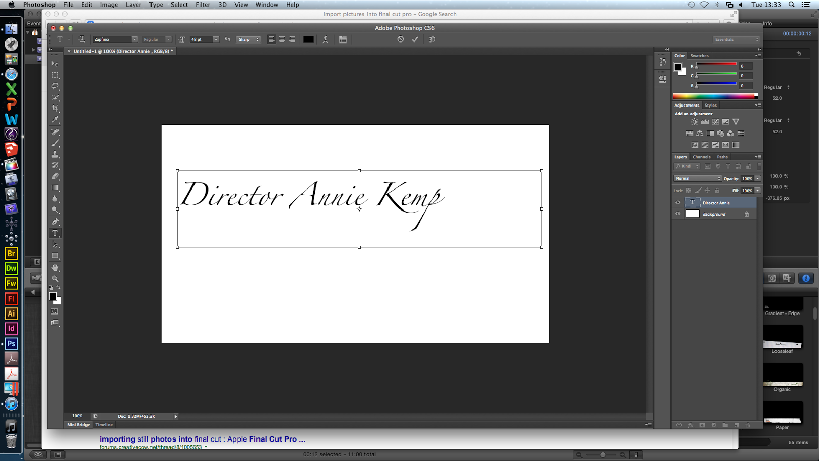
 On Photoshop, I explored different fonts for the titles that will appear on the flashbacks. I liked Zapfino because it looks like handwriting and is very neat. I wrote 'Director Annie Kemp' and 'director annie kemp' to see which one I preferred. I liked the lower case title because it connotes carelessness - though the killer is a doctor, he does not focus on capitalising letters because he has more important things to be doing (killing victims).
Then I looked at Adobe Fan Heiti & Heiti, however I did not like these because they were professional-looking block letters which does not link with the plot our film opening.


Next, I looked at Chalkduster which looked like chalk written by hand. I liked this (however the chalk does not fit into the plot) so I played around with this font and added layers.


These were the different effects ^ and my favourite was fisheye.


After warping the text, I tried the font Zapfino and preferred this; and instead of having another layer with the same text, i wrote 'die die die'. I used the fisheye effect and changed the opacity so 'die die die' was grey and slightly faded. This places more attention on the title but still making the 'die' layer visible. This extra layer will indicate to the audience that the killer is obsessive, sadistic/blood-thirsty and therefore extremely dangerous.

Then, I played around with the fisheye for the 'die' layer:

^ This was a 100% bend and I did not like it so I chose -53% bend with a +33% horizontal distortion (below).

As well as the decrease in opacity, I blurred and slightly smudged 'die die die' to create a 'blown away' effect and this adds eeriness and mystery without taking too much attention away from the main red title.

Overall, I am pleased with how the typography turned out. I have chosen the Zapfino font in red and layer in black (however these colours will change depending on the colour of the flashback, for example if it is dark the second layer will be white). I will include different words in the second layer such as 'baby baby baby'. I want to repeat the word depending on how many letters are in the title (so 'Costume Designer Hayley Tibbs' = 'baby baby baby baby').
No comments:
Post a Comment