
Below is a record of the editing that we completed, as a group, during that time.

We decided to go with Ghost House Pictures, but to make it slightly different and more relatable to our genre we added the Cold Steel effect to make it darker so more sinister - conforming to our horror genre.

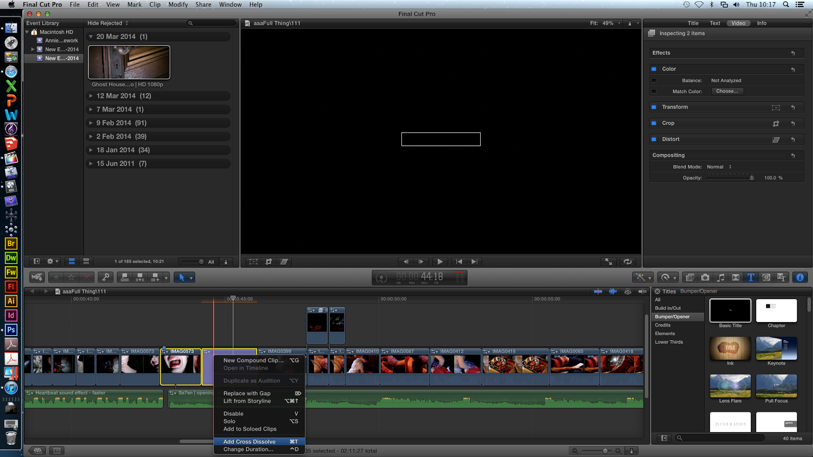
Next, we sped up the sequence so our opening did not go over 2 minutes because we still must include our homemade production company, the chase scene and the death scene.


We tested out different fonts, sizes and colours for the A+E sign to go in between the chase scene and death scene (during the fade out transition). We decided on a large white sign because white stood out the most. However, we soon realised we did not like this and Raman created a new one using photoshop.

Next, we checked the titles however agreed the colours did not go well with the clip's colours so Raman changed it all (see here). The red was difficult to read but the white was not so Raman swapped it - the main title was white and the 'shadows text' was red.

We changed the speed of the clip where the killer is underlining Adore & Endure to make it slower so the audience could read the text better. Also, the slowed effect adds suspense and makes the audience feel nervous and hesitant about this killer.


No comments:
Post a Comment