From my deconstruction (here), I chose our film opening to be produced by Ghost House because they have produced horror films such as Evil Dead, 30 Days Of Night and The Grudge. Therefore, Ghost House would be appropriate for our film opening because our genre is slasher/horror.
In addition to the production investigated in my previous post, there are other production companies which produced successful horror films. These include:
New Line Cinema (Texas Chainsaw Massacre & The Conjuring)
Blumhouse Productions (Sinister & The Purge)
Lionsgate (Saw & The Cabin In The Woods)
Universal Pictures (Hannibal & Mama)
Universal Pictures could be suitable for as our production company however some horror films they have produced such as The Thing and Mama contain supernatural themes as well. Our genre is strictly slasher so Universal would not be appropriate.
Though these are well-known production companies, my group and I wanted our existing production company to appear ominous and dark to foreshadow our film opening to the audience. Therefore, we were considering either Twisted Pictures (also produced the Saw films & Texas Chainsaw Massacre 3D) or Ghost House because they looked dark and sinister which would be appropriate alongside our opening.
In the end, my group and I chose Ghost House because, from watching previous horror film openings from A-Level students we saw the majority of them had used Twisted Pictures. So we decided to choose something different. During the editing process, in Final Cut Pro we added a grey effect over the Ghost House clip so it was more dark and to conform to the horror genre.
Ghost House's conventions for their horror/slasher films is to have lots
of gore (Evil Dead) and scary-looking deranged characters (The Grudge &
Drag Me To Hell). I felt this would be suitable as our production company because ours contains a lot of gore & includes a deranged and scary looking character because he wears a plain menacing mask and has words etched into his skin.
Now that I had created the dripping text of our production companies name, "KILLS PRODUCTIONS", and we had the footage of the wound that Raman had created dripping blood within a sink, I needed to merge them together, creating the effect that my group and I had discussed.
However, on trialling this out, I was unable to manipulate the footage of the special effects make-up to incorporate the video of the dripping text made in Photoshop, and when I researched on how to do this, I found that it wasn't really possible unless you had "After Effects" software downloaded. I wasn't even able to add an effect to make it look as if the text was dripping down with the blood, adding a caption rather than using the Photoshop video. And therefore, I was forced to have to think of something else to make our production company extract, rather than what I had planned and created- the dripping text of the production companies name.
On researching, I found a number of different inspirations that I could apply to the special effects footage, however, there was one picture that I saw that really caught my eye- shown to the left.
I decided to re-create this image, applying the name of our production company, "KILLS PRODUCTIONS", rather than "ZOMIE". The idea was to then have the image follow the footage of the sfx wound that Raman had made.
So, after I had created my version of the image above, shown to the right, I carried out my plan, adding it to the footage of the special effects makeup created wound, also applying the original music that I had been planning to use in my previous blog post about the production company.
You can see the result in the video shown below:
As you can see, this experiment didn't go very well- I really didn't like the finished result. I decided to start yet again, taking the sfx wound footage in the sink, and seeing what I could do with the resources on final cut pro.
Below shows screen shot of what I did to this footage, creating the result that I was finally happy with as our production company:
In the screen shot above, you can see the user face of final cut pro, of which I have uploaded the sliced wrist special effects makeup footage onto. On here, I have many effects- sound and visual- that I can experiment with, compared to what I have been using- MovieMaker at home.
Looking through the options of titles, I found a title called "Dramatic" that takes the title, and makes the words get bigger on the screen. Liking this effect, I added the name of the production company "KILLS PRODUCTIONS", looking at the effect that it gave.
To get a better idea of what it would look like, I also changed the font, choosing "GAZ" which was a block lettering font with parts of the letters looking "damaged"- adding more texture than the normal block letting.
This is what the words looked like, zooming out as a transition- and I found that I really liked it.
Looking at the footage I had so far, I felt it looked too plain for a production company extract, and so I looked at the effects that were given. Eventually, I chose to add the "Quick Flash/Spin" effect to the first section of the clip, creating close up shots of the wound before the rest of the video was played with no effects, introducing the "KILLS PRODUCTIONS" text after the Quick Flash/Spin effect.
Going through the sound options available, I chose to add two "Low Frequency Hit FX" sounds where the Quick Flash/Spin effect occurred, using the dramatic thumping sounds to add to the building of tension.
I also added the sound of a photocopier to the rest of the extract, adding background noise that fit the image on screen, not sounding too out of place.
To the photocopier sound, I also edited the last few seconds, making the intensity of the music die down so that it would have a smoother transition out of the production company extract and into the film opening footage.
At this point, I was happy with what I had done, but wasn't completely finished with the audio. It just needed something else to finish it off. To resolve this, I added a low level, background water dripping sound to the whole of the extract, adding a more realistic sound to be seen in a bathroom- where the footage is filmed- and also linking to the dripping of blood into the sink.
Finally, I edited the sound of the water dripping so that it got quieter at the end of the extract, again making it have a smoother transition when leading into the rest of the film opening video.
Below, you can see the finished video of the production company extract:
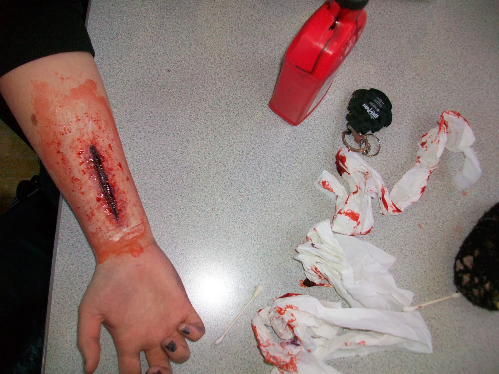
I re-did the bloody wrist for the production company (previous attempt http://www.anniehayleyraman.blogspot.co.uk/2013/12/pi-wrist.html ) because the format of the video was not working well with Final Cut Pro. So I applied special fx make-up to Annie's wrist and poured blood down a sink and filmed it. I used the same techniques and colours as before, but this time I made one vertical cut as seen in Blackout:
However, I made the wrist look more gruesome and gory and I put blood all over her wrists as if she had been bleeding a lot.
I did this firstly applying 2 coats of liquid latex, then moulding on the scar wax and blending it out to look like skin. I left a gap between 2 bits of wax - this formed the cut.
Then, I put black make-up in the 'cut' to make it look deeper and put purple-red make up on top of the black and around the edges and blended it out. Lastly, I applied the fake blood in and around the cut and dabbed it, then re-applied to make the blood look more realistic.
As a group we had to think about creating our own production company and we decided that we would all create our own version and then see which one we liked best or include aspects of all three. As I wasn't happy with my previous examples, I decided to focus more on the typography of the lettering. I watched the YouTube video below on how to create the blood dripping effect and for the moment decided to place it onto a plain black background. After playing around with the different tools, I decided to change the aim so it was all twisted and creepy rather than the blood dropping.
This is how the typography turned out, this could be effective for my idea if I decide to have the blood dripping down the whole of the screen, to reveal these letters.
Continuing on with this simplistic idea, I added the picture to Photoshop in the hope of adding a knife slashing sound effect. I decided the one below was simple enough and converted it into an MP3 format. I then added this into the project and made sure it was at the correct time.
The video below is the clip complete with knife sound, but it is of a very low quality and can be improved greatly. If we manage to include the blood dripping down effect in our finished product I think it would look more professional.
When using Adobe Illustrator to try out the dripping paint effect, I had a lot of trouble from the beginning, I couldn't seem to even find the simple circle tool but after a while and looking online at a lot of tutorials and help sites I managed to find my way around the program.
Following the tutorial above, I managed to create some simple red 'paint' drips which I can edit to appear more like blood, by changing the colour, and the consistency. I am then hoping to edit the text onto it to make the idea for the production company.
With the combination of mine, Raman's and Annie's ideas we are hoping to have the blood dripping down from the letters but maybe with the writing on the sink it could be effective.
Having deconstructed previous homemade production companies by fellow media students, I decided to create my own.
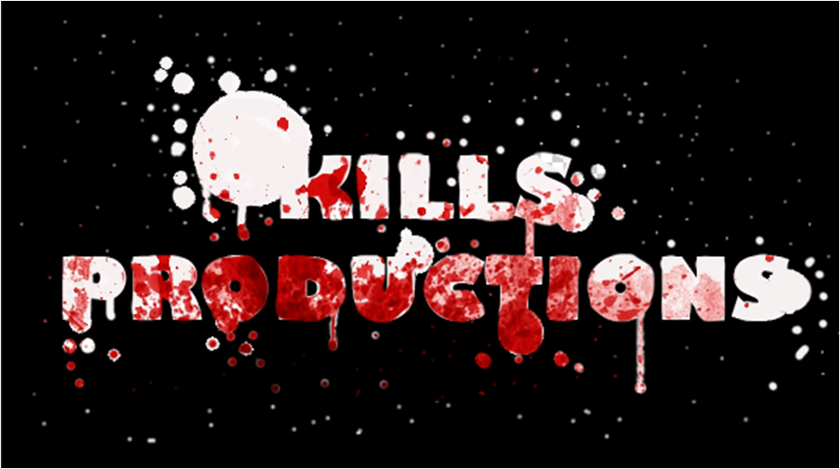
My idea for our production company animation was to have the two words, "KILLS PRODUCTIONS", (our production company name), on a light coloured background with blood dripping down from the words. On the website "Myfonts" I looked at the different "blood" fonts to get inspiration on how the one I make will look like. Below shows the different fonts that I most liked:
This font is called Kerberos Fang. It makes the letters look like painted blood with a small amount of splattered blood around each letter.
Called DINfun Pro™ Halloween, this font simply takes simple straight, block font, adding drips of blood to each letter.
This font is called Nyctophobia. It produces the effect of blood splatter and dripping, making up each letter.
The font above is called Blood. Each letter is made up of the formation of dripping blood.
Having looked at these different types of fonts, I feel that by combining Kerberos Fang and DINfun Pro™ Halloween, I would get the font type that I want. This combines the ideas of the dripping blood and the small amount of blood splatter around each letter, making the effect look more realistic.
Not having used any type of animation technology before, I had to do some research into what to use to get the effect that I wished, how to then use it, and then how to create what I have planned.
In my research, I came across this short clip (shown above). Within it, the word "Blood" is dripping blood, making a pool of it under the word. As I saw it, I hoped I would be able to find out what program to do it on, and use this effect to make my production company clip. However, on looking into it further, I found you had to buy or download the software "blender"- both of which I was reluctant to do, unless I couldn't find a better alternative. Because of this, I carried on looking for different animation methods.
Finally, on YouTube, I found a tutorial of how to make the dripping blood text that I had imagined. It taught me how to make the image of blood dripping text from scratch, on Photoshop- a program that is available to me at school.
Going through all the steps, giving correct measurements and information on alternative methods to create this effect, this tutorial really helped me feel comfortable with making this image, assuring me that I would be able to produce, if not the same, a similar image to the one that they create.
The only problem that this Photoshop tutorial posed was that it was only created a single image, and not an animation of dripping blood from the text. To resolve this, I looked on YouTube again to see if I could take this image and put an animation onto it.
Eventually, I found the tutorial shown above, that showed me how to take an image made or placed in Photoshop, and manipulate it to create an animation timeline, that when played, created a short animation.
The skills I learnt from this tutorial, I felt that I could use to make the image that I would be able to create with the first tutorial, turn into an animation with blood dripping from the words "KILLS PRODUCTIONS".
Construction of Idea
Making the Initial Image
First I made a new Adobe Photoshop document, sizing it at 600 pixels by 400 pixels and naming it "Kills Productions".
To this new document, I used the text function to add the words "KILLS PRODUCTIONS" in a dark red colouring, making the font to be "Calibri".
Selecting the object that I just created- the text- I clicked on the "Align Horizontal Centers" icon at the top of the screen, making the text appear centered on the document.
The next step was to add simple straight lines from each of the letters that I had made. They all had to be coming from different places from each letter, and be a variety in thicknesses.
This step is shown to the left, and I applied it with the pencil tool.
Once I had finished adding all the lines, I needed to apply a "Liquify" filter onto the entire image.
To do this, I had to go to the "Filter" icon at the top of the screen, and select "Liquify".
Using the pucker tool, I made each line appear irregular, squeezing the lines- this would make it look more realistic.
I then used the bloat tool to enlarge the drips of blood at the bottom of the lines, making them look more like drips.
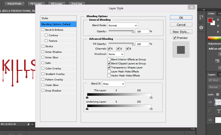
Once this step had been finished, I had to make it look more realistic by using a "Layer Style" on the text layer.
Here, I added a drop shadow, changing the distance, spread and size of it with the tools that it gave me.
I also added effect to the structure and shading of the text, adding depth to make it look more 3D.
To the gradient overlay, I made the blend mode to be soft light- softening the depth that I had added, keeping the "liquify" effect.
The final image that I was able to produce is the one shown below:
At this stage, I needed to take the image that I had just created and make an animation out of it.
To do this, I needed to take the tutorial that I had found on YouTube, and apply the techniques taught on that to my idea.
First, I opened the animation time line method that was available to me, and to this, I added the background layer, and the text layer that I already had. This, I found, produced the first slide within my timeline animation.
The next thing that I did was to duplicate the text layer that I had, naming it "2", and to this layer, and only this layer, I cut off the end "drip" of every drip of blood on every letter. I then went back to the "liquify" filter, using the bloating tool to add the drip back onto each line. Saving this as the second slide on the animation timeline, I repeated this action over and over until there were no more line "drips of blood" left. Playing the sequence that I had made through, it produced an animation, giving the effect that the blood was being sucked back into each letter- the opposite to what I wanted- so I reversed the slides, to make it look as if the drips were coming out of the words.
The small clip below shows what was produced at this point in time:
But looking at this clip, I still felt that it needed more. I added a black background, and put the clip onto movie maker, adding a sound that I found on YouTube, along with a sound that I made of running "blood"/water. The final product is shown below:
Deciding that this clip was too dark, not enabling the dripping blood effect to be seen as clearly, I added a lighter, cream background, changing the non diegetic sound to compare the differences between the two:
On comparison, even though it is darker, I feel that the black one is the best, based on the idea that it is the most effective with the sound to create tension, and that it links to the dark and scary theme of the slasher genre. If we highlighted the words and dripping blood more, perhaps it would resolve the issue with the poor visibility of the dripping of the blood.
For our film opening, we want to plan, create and edit our own production company, but to do this, we needed to have a better understanding of previously homemade production companies made by other media students. We found a You Tube channel called lpgsmedia, of which had loads of different homemade production companies made before their film openings.
Looking through the different options, I found a few production companies that I particularly liked, and that gave me inspiration. Below shows deconstructions that I carried out for the few I felt were the best:
A Day In The Life Of A Nerd
"Entertainment 5 You, That's For+1 You"
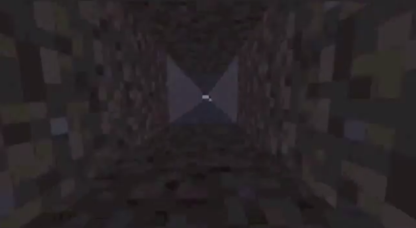
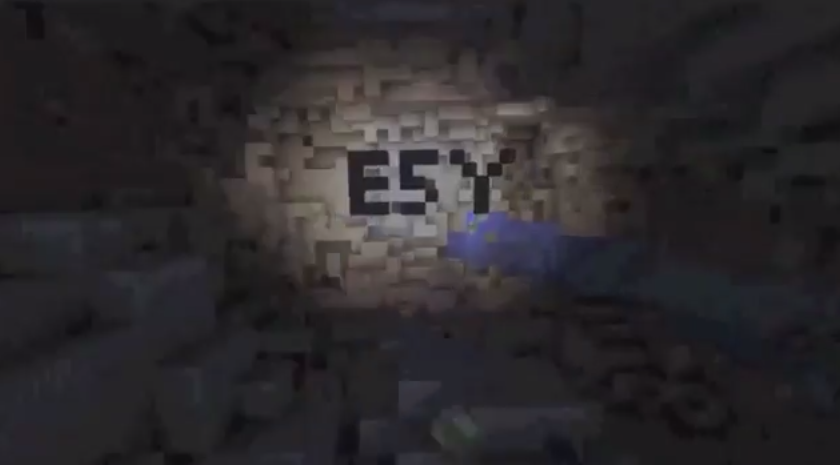
Lasting nine seconds overall, this production company was made on mindcraft.
The clip starts with the world represented with blocks of green and blue, simulated into a circle with the mindcraft computer game.
As a voice over initiates, with someone simply going"woo, wooooooooshh...." into the microphone, the image starts zooming into the "world" image made up of blocks, going into a small square on the face of the "world" object, simulating a tunnel going "underground".
The clip ends with the screen showing the bottom of the tunnel that the image has been zoomed into , holding the word "ESY" made from the squares that are making the images, such as the world, and the production company name, placed on two lines, transitions in from the left and right stating "Entertainment 5 You That's For+1 You" and then sliding off to the left and right again.
This production company clip is really creative and interesting. It links video and editing to a game simulator that produces the GUI output for this clip. The production company name is also really well thought of, and is almost funny if you think about it- "Entertainment 5.. thats For+1"-.
I think that it would be a good idea to have this as an option- using mindcraft- for our production company clip. The only thing that isn't very good about using mindcraft is that it looks very pixilated, making the quality, and the professional finnish of the end result not completely optimum.
Blink
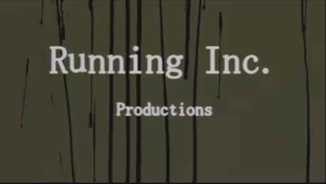
"Running Inc. Productions"
Lasting a total of eight seconds, this production company clip has used a mixture of film and computer editing software to create the effect that is shown.
The entire clip is basically a reverse recording of running ink- so the ink is running upwards. As this happens, the production company name "Running Inc. Productions" runs down the screen as if it is "running ink". This ends with the initial background of a light green colour to fade into a back block colour, the production company name changing from the black ink to a white colour to show up in contrast against the black background.
The sound within this is a long deep stringed instrument playing two long chords that slowly build up through the eight second range, adding tension and creating the mood of suspense, indicating to the audience that this is going to be a scary film.
Overall, I think this is a really good idea. It's simple but effective and interesting to look at. For our homemade production company, we could take this idea, but have it look like blood rather than ink, so that it links to our slasher genre.
The Prophet
FLUW STUDIOS
This one lasted four second and was created with a mixture of video and photoshop.
The clip starts with an extreme close up of an eye. The eye simply closes and opens again, with the image of the same eye but edited
with photoshop to make it have a harsher resolution with colours in the iris. The production company name "FLW STUDIOS" is shown in the image of the edited eye within the white of the eye.
The sound within the four second clip is silent for the non- edited video of the eye closing and opening, but is a constant, tension building sound that echoes and creates a sound bridge into the opening scene of the film.
This idea was simple, but was really interesting to look at. The use of the makeup applied eye, fooling the audience, and then having the edited eye with the non-diegetic music over the top is really effective for getting the audience into the mood where they know that the film isn't going to be what it seems. I however wouldn't use this as an idea for our film opening as the only way to develop this is to make it look very similar to the original, and we don't want to copy other peoples work.
Hope
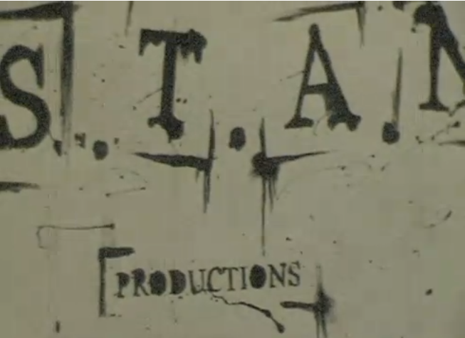
"S.T.A.N. Productions"
The last one that I deconstructed lasted six seconds, and was simply a video.
The video consisted of a zooming out effect of the production company name "S.T.A.N. Productions" on a piece of paper in a ink type typography.