Looking through the different options, I found a few production companies that I particularly liked, and that gave me inspiration. Below shows deconstructions that I carried out for the few I felt were the best:
A Day In The Life Of A Nerd
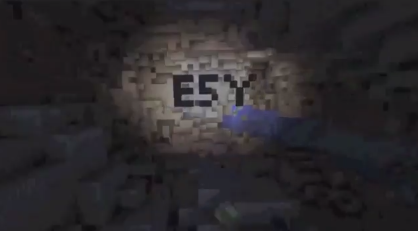
"Entertainment 5 You, That's For+1 You"
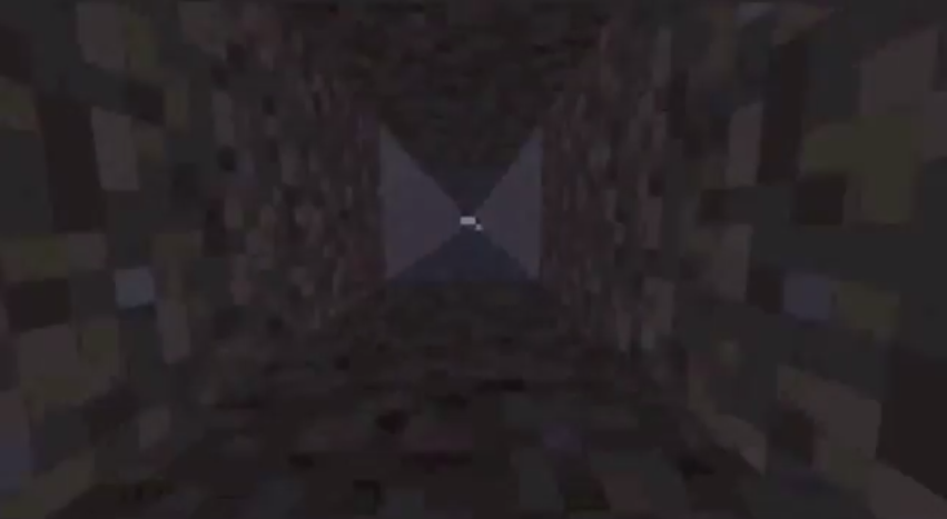
 Lasting nine seconds overall, this production company was made on mindcraft.
 The clip starts with the world represented with blocks of green and blue, simulated into a circle with the mindcraft computer game.
 As a voice over initiates, with someone simply going"woo, wooooooooshh...." into the microphone, the image starts zooming into the "world" image made up of blocks, going into a small square on the face of the "world" object, simulating a tunnel going "underground".
The clip ends with the screen showing the bottom of the tunnel that the image has been zoomed into , holding the word "ESY" made from the squares that are making the images, such as the world, and the production company name, placed on two lines, transitions in from the left and right stating "Entertainment 5 You That's For+1 You" and then sliding off to the left and right again.
This production company clip is really creative and interesting. It links video and editing to a game simulator that produces the GUI output for this clip. The production company name is also really well thought of, and is almost funny if you think about it- "Entertainment 5.. thats For+1"-.
I think that it would be a good idea to have this as an option- using mindcraft- for our production company clip. The only thing that isn't very good about using mindcraft is that it looks very pixilated, making the quality, and the professional finnish of the end result not completely optimum.
Blink
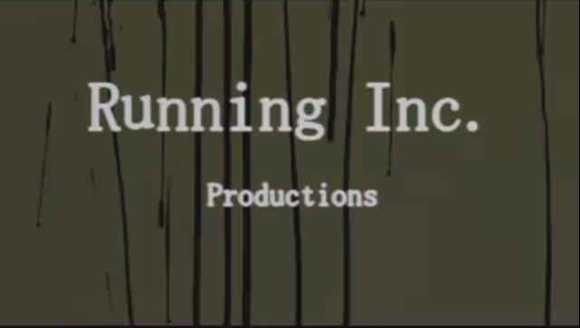
"Running Inc. Productions"
Lasting a total of eight seconds, this production company clip has used a mixture of film and computer editing software to create the effect that is shown.

 The entire clip is basically a reverse recording of running ink- so the ink is running upwards. As this happens, the production company name "Running Inc. Productions" runs down the screen as if it is "running ink".

 This ends with the initial background of a light green colour to fade into a back block colour, the production company name changing from the black ink to a white colour to show up in contrast against the black background.
The sound within this is a long deep stringed instrument playing two long chords that slowly build up through the eight second range, adding tension and creating the mood of suspense, indicating to the audience that this is going to be a scary film.
Overall, I think this is a really good idea. It's simple but effective and interesting to look at. For our homemade production company, we could take this idea, but have it look like blood rather than ink, so that it links to our slasher genre.
The Prophet
FLUW STUDIOS

 This one lasted four second and was created with a mixture of video and photoshop.
 The clip starts with an extreme close up of an eye. The eye simply closes and opens again, with the image of the same eye but edited
with photoshop to make it have a harsher resolution with colours in the iris. The production company name "FLW STUDIOS" is shown in the image of the edited eye within the white of the eye.
The sound within the four second clip is silent for the non- edited video of the eye closing and opening, but is a constant, tension building sound that echoes and creates a sound bridge into the opening scene of the film.
This idea was simple, but was really interesting to look at. The use of the makeup applied eye, fooling the audience, and then having the edited eye with the non-diegetic music over the top is really effective for getting the audience into the mood where they know that the film isn't going to be what it seems. I however wouldn't use this as an idea for our film opening as the only way to develop this is to make it look very similar to the original, and we don't want to copy other peoples work.
Hope
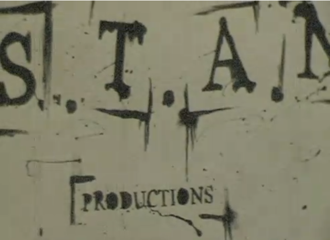
"S.T.A.N. Productions"


No comments:
Post a Comment