Friday, 13 December 2013

My Homemade Production Company

Plan

Having deconstructed previous homemade production companies by fellow media students, I decided to create my own.

My idea for our  production company animation was to have the two words, "KILLS PRODUCTIONS", (our production company name), on a light coloured background with blood dripping down from the words. On the website "Myfonts" I looked at the different "blood" fonts to get inspiration on how the one I make will look like. Below shows the different fonts that I most liked:

This font is called Kerberos Fang. It makes the letters look like painted blood with a small amount of splattered blood around each letter.

Called DINfun Pro™ Halloween, this font simply takes simple straight, block font, adding drips of blood to each letter.


This font is called Nyctophobia. It produces the effect of blood splatter and dripping, making up each letter.


The font above is called Blood. Each letter is made up of the formation of dripping blood.


Having looked at these different types of fonts, I feel that  by combining Kerberos Fang and DINfun Pro™ Halloween, I would get the font type that I want. This combines the ideas of the dripping blood and the small amount of blood splatter around each letter, making the effect look more realistic.

Not having used any type of animation technology before, I had to do some research into what to use to get the effect that I wished, how to then use it, and then how to create what I have planned.


In my research, I came across this short clip (shown above). Within it, the word "Blood" is dripping blood, making a pool of it under the word. As I saw it, I hoped I would be able to find out what program to do it on, and use this effect to make my production company clip. However, on looking into it further, I found you had to buy or download the software "blender"- both of which I was reluctant to do, unless I couldn't find a better alternative. Because of this, I carried on looking for different animation methods.


Finally, on YouTube, I found a tutorial of how to make the dripping blood text that I had imagined. It taught me how to make the image of blood dripping text from scratch, on Photoshop- a program that is available to me at school.

Going through all the steps, giving correct measurements and information on alternative methods to create this effect, this tutorial really helped me feel comfortable with making this image, assuring me that I would be able to produce, if not the same, a similar image to the one that they create.


The only problem that this Photoshop tutorial posed was that it was only created a single image, and not an animation of dripping blood from the text. To resolve this, I looked on YouTube again to see if I could take this image and put an animation onto it.

Eventually, I found the tutorial shown above, that showed me how to take an image made or placed in Photoshop, and manipulate it to create an animation timeline, that when played, created a short animation.

The skills I learnt from this tutorial, I felt that I could use to make the image that I would be able to create with the first tutorial, turn into an animation with blood dripping from the words "KILLS PRODUCTIONS".

Construction of Idea

Making the Initial Image

 First I made a new Adobe Photoshop document, sizing it at 600 pixels by 400 pixels and naming it "Kills Productions".

To this new document, I used the text function to add the words "KILLS PRODUCTIONS" in a dark red colouring, making the font to be "Calibri".

Selecting the object that I just created- the text- I clicked on the "Align Horizontal Centers" icon at the top of the screen, making the text appear centered on the document.


The next step was to add simple straight lines from each of the letters that I had made. They all had to be coming from different places from each letter, and be a variety in thicknesses.

This step is shown to the left, and I applied it with the pencil tool.
 Once I had finished adding all the lines, I needed to apply a "Liquify" filter onto the entire image.

To do this, I had to go to the "Filter" icon at the top of the screen, and select "Liquify".

Using the pucker tool, I made each line appear irregular, squeezing the lines- this would make it look more realistic.

I then used the bloat tool to enlarge the drips of blood at the bottom of the lines, making them look more like drips.
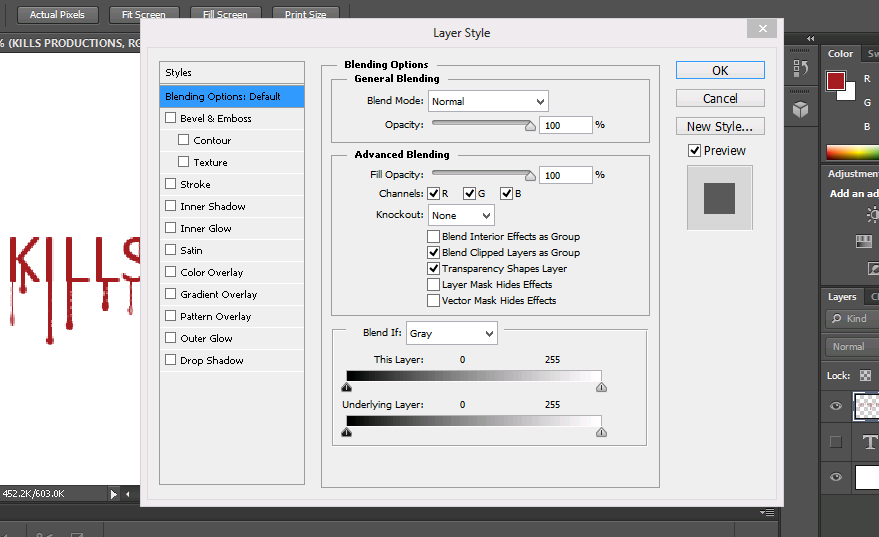
 Once this step had been finished, I had to make it look more realistic by using a "Layer Style" on the text layer.

Here, I added a drop shadow, changing the distance, spread and size of it with the tools that it gave me.

I also added effect to the structure and shading of the text, adding depth to make it look more 3D.

To the gradient overlay, I made the blend mode to be soft light- softening the depth that I had added, keeping the "liquify" effect.

The final image that I was able to produce is the one shown below:

At this stage, I needed to take the image that I had just created and make an animation out of it.

 To do this, I needed to take the tutorial that I had found on YouTube, and apply the techniques taught on that to my idea.

First, I opened the animation time line method that was available to me, and to this, I added the background layer, and the text layer that I already had. This, I found, produced the first slide within my timeline animation.

The next thing that I did was to duplicate the text layer that I had, naming it "2", and to this layer, and only this layer, I cut off the end "drip" of every drip of blood on every letter. I then went back to the "liquify" filter, using the bloating tool to add the drip back onto each line. Saving this as the second slide on the animation timeline, I repeated this action over and over until there were no more line "drips of blood" left.
Playing the sequence that I had made through, it produced an animation, giving the effect that the blood was being sucked back into each letter- the opposite to what I wanted- so I reversed the slides, to make it look as if the drips were coming out of the words.


The small clip below shows what was produced at this point in time:

But looking at this clip, I still felt that it needed more. I added a black background, and put the clip onto movie maker, adding a sound that I found on YouTube, along with a sound that I made of running "blood"/water. The final product is shown below:
Deciding that this clip was too dark, not enabling the dripping blood effect to be seen as clearly, I added a lighter, cream background, changing the non diegetic sound to compare the differences between the two:

On comparison, even though it is darker, I feel that the black one is the best, based on the idea that it is the most effective with the sound to create tension, and that it links to the dark and scary theme of the slasher genre. If we highlighted the words and dripping blood more, perhaps it would resolve the issue with the poor visibility of the dripping of the blood.

Thursday, 12 December 2013

Deconstruction: Non-Diegetic Sounds

Deconstruction of Non-Diegetic Sounds:

As we are still undecided whether we are including an actual violent death scene I decided to look into the different music and sounds heard during a death scene. This should hopefully give us an idea of what types of music and/or sounds we should have if we decide to include a death scene.


One of the most recognisable sounds from a horror film, the scary horror music from Psycho is extremely well-known as it automatically makes any scene so much more scarier. The fast paced beats make the audience think of a countdown, leading up to something which would appear to be a death. The change in pitch also adds to this and the weird scraping knife sound that the instruments create is really effective. The low paced 'humming' sounds which interrupt the shrill beats also provide variation so the music isn't the same all the way through.


In this scene from The Texas Chainsaw Massacre: The Beginning, the dialogue and the diegetic sound of the chainsaw are probably more dominant but I am focusing on the music in the background as I feel without it, the death would not be as effective.
During the first 20 seconds or so, the audience should be listening to the dialogue but there is some slow background music which is very consistent at the same speed and volume, almost luring the audience into a false sense of security while at the same time making sure they are conscious of the situation at hand. This builds up slightly, making the audience think something big is going to happen but it's kind of a red herring as the characters change.
Almost immediately though, the music increases, even louder than before and the quicker tempo and the added drum beats make it sound more impatient and builds up to the moment where Leatherface appears. The combination of a deep rumbling noise and a higher pitched note used also add a sinister, eerie feel to the situation and help to increase the tension even more.
Throughout the next moments the music stops, there are drum beats but they are quieter than before, however the music increases again quickly as the action in the scene becomes more intense. The sound of the chainsaw then overpowers the music, showing how impressive and deadly it is and to make the audience focus on the weapon itself.
The simple drum beats return slightly louder and then the stringed instruments also join in towards the end of the clip, to stop the scene from being silent with just the man talking. The non-diegetic sound during this sequence is very effective as it is creepy and adds tension to the scene as the music seems to fit the action perfectly.


In another clip from Texas Chainsaw Massacre, there is a lot of screaming from the girl but the sound effects in the background can still be heard. From the very beginning we can hear low pitched bass notes almost once every second, as the girl tries to run away, but then as he catches her and picks her up, a high pitched ticking noise joins in almost to signify she can't escape now.
The bass notes are still playing but the tempo has become much more fast paced and urgent. Gradually the sound of stringed instruments, possibly violins, builds up to increase the tension and also the desperation in her screams. The whirring of the chainsaw then joins in with the music, obviously telling the audience what is about to happen and the steady rhythm of the ticking helps make the scene more scary for the audience.


I decided to mention the song below which is also from The Texas Chainsaw Massacre, as it is completely different from what you would expect from a trailer for a horror movie. This extremely subverts the conventions of trailer music as you would not expect a film like TTCM to use a song like this to promote the film, however it is still one of the most well-known horror films around.


During my research, I also decided to look at horror music that other people had done themselves to see how simple it would be if we were to do it ourselves from scratch. I liked the use of the piano in this one for example, it sounds good especially with the deep notes in the background and the held notes (possibly strings). I also liked the big drum beat at the end as I think it's best to finish on a loud note rather than just fading out unless you want it to be creepy and feel it would worth with the scene. To me however, it didn't sound that scary, I think it wasn't either fast or slow enough, it was kind of in the middle and just sounded to me like it was sad music and I could picture it being in a tragedy film, rather than a scary horror film.


During my investigation, I found that the piano and also a lot of stringed instruments were mostly used to create tension, that is why I feel that in our opening, it could be more effective if we decided to use those instruments if we choose to have music as it builds up the atmosphere to that final moment where usually a death or something important happens. As we don't have any experts in music in our group, we would either have to get help from a friend or try to keep it relatively simple, but still scary.


Homemade Production Company Deconstructions

For our film opening, we want to plan, create and edit our own production company, but to do this, we needed to have a better understanding of previously homemade production companies made by other media students. We found a You Tube channel called lpgsmedia, of which had loads of different homemade production companies made before their film openings.

Looking through the different options, I found a few production companies that I particularly liked, and that gave me inspiration. Below shows deconstructions that I carried out for the few I felt were the best:

A Day In The Life Of A Nerd

"Entertainment 5 You, That's For+1 You"

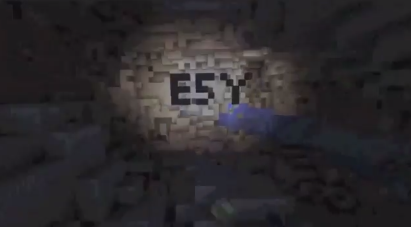
Lasting nine seconds overall, this production company was made on mindcraft.

The clip starts with the world represented with blocks of green and blue, simulated into a circle with the mindcraft computer game.

As a voice over initiates, with someone simply going"woo, wooooooooshh...." into the microphone, the image starts zooming into the "world" image made up of blocks, going into a small square on the face of the "world" object, simulating a tunnel going "underground".

The clip ends with the screen showing the bottom of the tunnel that the image has been zoomed into , holding the word "ESY" made from the squares that are making the images, such as the world, and the production company name, placed on two lines, transitions in from the left and right stating "Entertainment 5 You That's For+1 You" and then sliding off to the left and right again.

This production company clip is really creative and interesting. It links video and editing to a game simulator that produces the GUI output for this clip. The production company name is also really well thought of, and is almost funny if you think about it- "Entertainment 5.. thats For+1"-.

I think that it would be a good idea to have this as an option- using mindcraft- for our production company clip. The only thing that isn't very good about using mindcraft is that it looks very pixilated, making the quality, and the professional finnish of the end result not completely optimum.

Blink

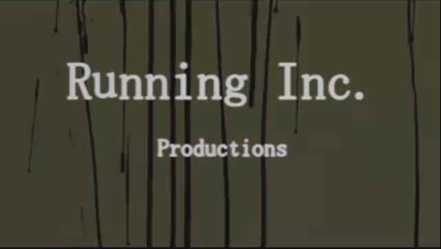
"Running Inc. Productions"


 Lasting a total of eight seconds, this production company clip has used a mixture of film and computer editing software to create the effect that is shown.

The entire clip is basically a reverse recording of running ink- so the ink is running upwards. As this happens, the production company name "Running Inc. Productions" runs down the screen as if it is "running ink".

This ends with the initial background of a light green colour to fade into a back block colour, the production company name changing from the black ink to a white colour to show up in contrast against the black background.

The sound within this is a long deep stringed instrument playing two long chords that slowly build up through the eight second range, adding tension and creating the mood of suspense, indicating to the audience that this is going to be a scary film.

Overall, I think this is a really good idea. It's simple but effective and interesting to look at. For our homemade production company, we could take this idea, but have it look like blood rather than ink, so that it links to our slasher genre.

The Prophet

FLUW STUDIOS


This one lasted four second and was created with a mixture of video and photoshop.

The clip starts with an extreme close up of an eye. The eye simply closes and opens again, with the image of the same eye but edited
with photoshop to make it have a harsher resolution with colours in the iris. The production company name "FLW STUDIOS" is shown in the image of the edited eye within the white of the eye.

The sound within the four second clip is silent for the non- edited video of the eye closing and opening, but is a constant, tension building sound that echoes and creates a sound bridge into the opening scene of the film.

This idea was simple, but was really interesting to look at. The use of the makeup applied eye, fooling the audience, and then having the edited eye with the non-diegetic music over the top is really effective for getting the audience into the mood where they know that the film isn't going to be what it seems. I however wouldn't use this as an idea for our film opening as the only way to develop this is to make it look very similar to the original, and we don't want to copy other peoples work.

Hope

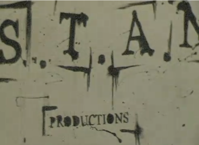
"S.T.A.N. Productions"


The last one that I deconstructed lasted six seconds, and was simply a video.

The video consisted of a zooming out effect of the production company name "S.T.A.N. Productions" on a piece of paper in a ink type typography.


This final form of typography


Practical Investigation of Production Company

 
In the opening for Blackout (2008), a woman has cut her wrist which we see through a close up. Then a straight cut is used to show us another close up, but of the blood dripping down the side of the white bath. A white bath is effective because the blood is made more prominent, however this would be more effective and gruesome if the audience were to see the blood dripping down the side of the bath.

This inspired us to create a production company animation where the person cuts their wrist and the blood drips down to form 'Kills Productions'. First, I applied liquid latex over my wrist so I can simply peel it off and all the make-up applied on top will come off.
Next, I applied scar wax and rolled it into long strips so when make-up and fake blood is put on it, the cut looks very deep. Then, I rubbed the outside edges to blend it in with my skin.
Then, I put black make-up in the 'cut' and in the corners where my skin met the scar wax so to create a shadow to make the cut look deeper. I applied a dark red colour on top of the black and on the scar wax around the cut to make it look bloody and wounded.

Next, I applied fake blood all over my wrist and in the cuts and let some drip down to make it look more gory and realistic. Then, I got some more fake blood and poured it down the side of a white sink, as seen in Blackout, and filmed it using a close up of my wrist then moved the camera downwards to show the blood drizzling down. This short clip will be added and edited to Annie's practical to make it look like this blood forms the words 'Kills Productions'.


Overall, I like our production company animation because it hints our slasher genre to the audience, unlike some slasher films that have production companies with misleading animations as investigated in my deconstruction post. As our opening will only be 2 minutes long, we want our audience to know they are watching a slasher film so this animation will establish that.

I began editing the clip and added sound. I chose a heavenly sound because it is parallel to this person who has bled to death. The sound is very ambiguous and denotes heaven, death, life, purity and is quite mysterious. I chose to include the sound from about 4 minutes in.


Here is the edited version with sound:


Deconstructions of Existing Professional Production Companies for Slasher/Horror

Evil Dead
TriStar Production Company is represented by a horse that enters the screen through a god-like strobe of light around clouds which gives us a heavenly image. This does not fit in with the slasher genre of Evil Dead and seems quite misleading, so for our opening we should have a production company which hints to the audience what our genre is.

The next production company for Evil Dead is Film District and the camera moves down the sides of buildings then tilts upwards where Film District fades in an establishing shot of the buildings. This gives off an action genre, again, not Evil Dead's slasher genre.


Ghost House Pictures is the next production company for Evil Dead and this is more suitable to its genre because it shows a close-up of a doorknob and the door closing by itself which is scary because this has a supernatural element to it. Then, a skull appears in the keyhole - skulls symbolising death and disease. Also, the dark colours and low key lighting create a gloomy atmosphere. This is a better production company because it hints the genre to the audience, including the name.


American Mary
The first production company is Industry Works and has an image of a factory on a hill surrounded by clouds. Industry Works is 'wiped' on the hill and looks metallic, then each letter flashes light as if light has been passed over it. This bring attention to the name, especially as it is against a black backdrop. This fits in well with American Mary's slasher genre because it is dark and sinister looking.


The next production company is tt and this, like Industry Works, is against a black background which makes the name look more mysterious. However, a 'sun' rises behind the name which then subverts the previous mysteriousness theme and makes it seem playful and happy. This makes the production company seem versatile - that it can produce films of different genres. We would not have a flexible production company animation because our opening is only 2 minutes so we want to suggest our slasher genre as much as possible.


The Crazies
Overture is the first production company for The Crazies and it begins with a strip of blue shining over and across the name, which then illuminates for the audience to see properly. 'Films' then appears underneath, and shortly after 'a STARZ company'. To me, this seems quite cluttered because more words keep coming up when I believe that it should just be the name so it looks neater and more professional. So, for our production company we will include only the name, no other words.


Next, Participant Media appeared through a series of vertical multi-coloured lights and then the letters are pulled together from left and right. Once only the name is showing, fire blazes the screen which washes out the name and this fire is part of the opening of The Crazies so incorporating the opening with the production company looks interesting and professional.


Boogeyman 3
Stage 6 is the first production company and the logo is already on the screen. It keeps moving up and down slightly as if shown in an old cinema, then the background repeatedly changes to white and 'Films' appears. This does not indicate what type of genres Stage 6 caters for which is beneficial because, again, it shows its versatility.


Ghost House Pictures produces this film as well which proves that it is suitable for slasher and horror films. Also, it proves that it is a trusted company because they make popular films.
The production company name is shown again and this exits the screen when the camera is panning across a wall. This effect, as with The Crazies, makes the opening seem more professional and continuous because they are both smoothly incorporated.
For our production company, we should indicate to the audience what the genre is so they have a better understanding of our opening. Also, it must be quite simple with not a lot happening so to keep the audience engaged and not to confuse them. In addition, we should incorporate the opening with the production company animation as it looks better and more professional.