Monday, 31 March 2014

Typography (cont)

 From the previous titles I had made & put into Final Cut Pro, I received feedback that the title was difficult to read because it was read and the 'shadow' text was easier to read because it was white and stood out against the dark background. I tried inverting it but that did not work because the 'die' layer was rasterized.


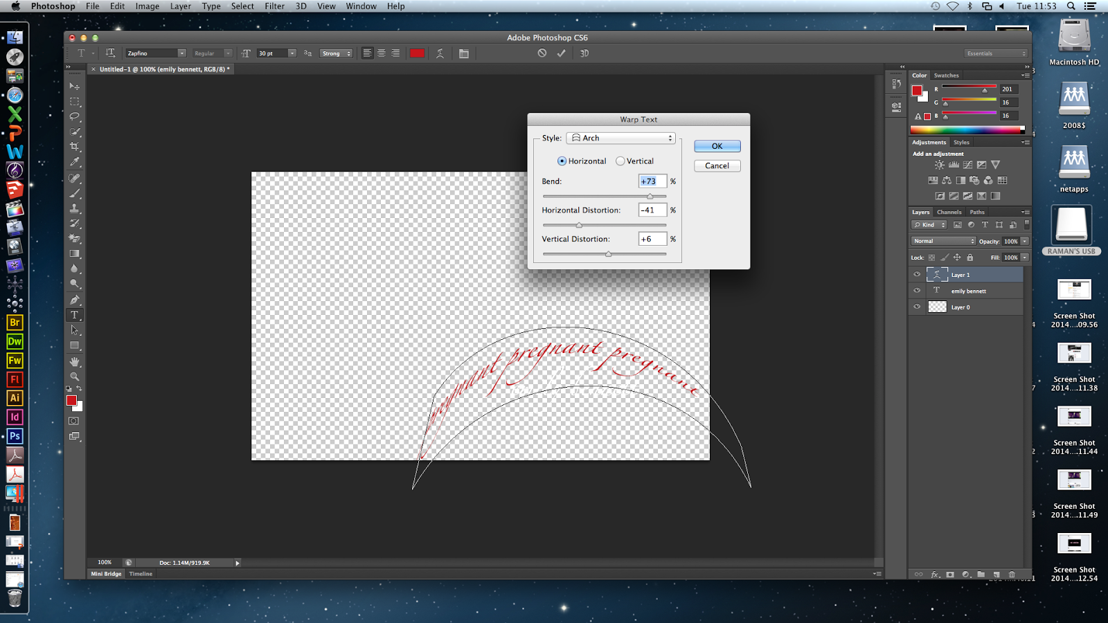
I changed the colours so the shadow text is red and the main title is white. I applied the arch warp on the words 'pregnant' going around actor Emily's name so the audience know she is pregnant as that is not made clear in the film opening because it would be something the audience discover later.

Next, I inserted the words 'strangle' on another title and used the inflate warp to expand it from one side. I like distorting the 'shadow' titles because its imbalance contrasting the straight main title represents the killer's thinking - he is a doctor so is clever and logical, but he is a killer with sick, twisted thoughts.
I duplicated the strangle layer and changed the colour to a darker red to add depth.
In the flashbacks where I made the last second change colour/saturation, I made a title which will flash up over the effect. Fisheye warp was applied to the title so it is enlarged and distorted. The title says foetus so the audience get a quick clue as to what the killer is taking out of the victim.

I inserted more titles which say
  • 'prostitute' (flag warp)

  • 'scream' (flag warp)

  • 'suffer' (inflate warp)
  • 2 'bloodthirsty' (fish warp and wrap around the actor's name)
  • 'hideout' (twist warp)

More Editing of the Death Scene Footage

As my targeted scene to edit is the death scene, I carried on with my editing of the footage in this scene, as shown in the evidence below:

In this session, my tasks were to cut down the extract so that it fit our two minuet time allowance. I also needed to perfect the editing to make it effective.


First ,  I started re-timing the shots where killer turns around, making them slower to add to the sudden contrast in the change of quick paced editing to the slow pace of this shot. This, although adding to the overall time, would add to the effectiveness of the footage.


I also added a black screen for the ending image, rather than just ending the opening scene on the killers forehead- making it look more professional.


Next, I went though the footage, speeding up and cutting shots, so that I could get the video to two minuets long, rather than the two minuets fifty seconds that it currently was. 


As I kept watching the last collection of shots, I decided that they needed flash backs between cuts of the killer turning around as the impact of the slow-motion got lost through the length of time it took the killer turning around. Adding quick flash backs in between cuts of this shot would not only build tension but also add to the dark and twisted feeling the footage gives off.


As a result of added the flash backs, I needed to go through the footage again, cutting off any un-necessary seconds.

Talking as a group, we felt that a problem that would be found within the comments of our first draft saying that the death scene is confusing because of all of the flash backs. Taking initiative to try and fix this possible problem, I decided to experiment with the effects that I could add to the flash backs to make it more obvious that they are, in fact, flash backs. Below shows my investigation:


Here, I have added the effect "Radial" as a transition into the flash back- the blur effect used to signify that its part of the killers memory. My idea with this is that as the extract is played, the flash backs would start off really blurry and get clearer and clearer- symbolising the fact that the killer is re-living the murder, it becoming more present than a memory.

I tried this idea out on a few of the flash backs with a few different types of "blur" effects that were available to me, but because of the length of them, it really didn't work (shown above). It  gave the viewer too much to look at and comprehend with such a small amount of time, and it also reduced the "shock" of the initial gore within the death scene.

I decided to leave the flash backs the way that they were, acting on changing them if necessary when we get feedback on our up-coming initial draft of our film opening.

Thursday, 27 March 2014

Evaluation of the Death Scene Non-Diegetic Sound

Having almost finished the final version of our film opening, I wanted to evaluate the non-diegetic sound that I created for the death scene.

Linking with the footage, I feel that, though the music is quite "action" themed, it adds tension and depth to the visuals in the clips of the gore that is shown. It's also a good way to get the viewer encased into the clips, the music being stimulating rather than too repetitive or boring making it appropriate for our film opening.

It also links to the target audience of 15 years and up, 15 being the age rating that we would give the film, as it relates to the type of music that people of that age range listen to. Rock music, of which it takes a lot of inspiration from, is the type of music that people in their late teens to early twenties can relate to, making it current and relevant to the viewers.

Being a slasher film, the non-diegetic sound of the most graphic scene within the film opening, the death scene, also needed to link to the preferences of the viewers, looking at the social groups that would like to watch this type of film genre- slasher. Being a low tone, techno-rock sound, the non-diegetic music also gives a feeling of intensity to the film opening, building up to a peak and then finishing off the extract nicely.

To conclude, the non-diegetic sound within the death scene, I feel, is very appropriate, linking to the footage, genre of the film opening, the target audience and the social groups that would watch a film of this genre.

A+E on Photoshop (Raman's Image & Blessing's Gif)


My group and I wanted an A+E title to appear in the fade out after the chase to make the opening seem more professional because the name of the film usually appears after something dramatic happens at the beginning.
 I found a picture of a hospital red cross sign and wanted that to be and + sign for A+E because we wanted the audience to believe A+E involved a hospital when it actually meant Adore + Endure. Also, from a hospital A+E our audience will be able to guess the killer is a doctor.
I typed A and E next to the plus sign and made it bold and added shadows and glows to the letters and sign from the Layer Style box.
I wanted to blur the harsh lines between the + and letters so used the blur tool. The blur tool did blur it but not a significant amount due to the shadow I had put around both the letters.
I put this into Final Cut Pro but it did not look very good. So I tried again but made it more simple and wrote A+E and blurred the edges using the Layer box again.

Again, this did not work and we received feedback that it did not look good so I got rid of it from the sequence.

Blessing, who knows a lot about Photoshop, made a moving image of the words 'Adore + Endure' being highlighted so the audience can read it better as before the words were unclear. Blessing darkened the words layer by layer and put the layers together in a moving sequence. This was then added to Final Cut Pro and this gif and darkened layers are shown below.


Fixing the sound for our Friday 28th March first draft deadline

Being that our deadline for our initial draft of the film opening is Friday 28th, I felt it prudent to fix, to the extent of my ability, the audio. Below shows the screen shots of what I did, with in-depth annotation explanation.


First of all, I took the audio that I had made for the death scene, disabling it, so that it wasn't deleted, but I could add a new non-diegetic sound instead. I also added the soundtrack that Hayley and I found on YouTube onto the footage- Tension Building Sound Track 3.


At the point in the footage where it goes from really fast pace editing to a continuous shot, I cut the sound, adding a quieter, more calm sound finishing off the scene and the film opening. This, I did to link to the building in intensity of the visuals in the footage, then the peak and  then the after wave- ending the extract.


I then started looking at the transition from the chase scenes non-diegetic sound to the death scenes. This, I unfortunately was able to do little to make better, rendering the chase scenes sound to be cut off just before the final few shots. This will be something that we will have to fix, but will not be able to do before the Friday deadline.


I then decided to keep my idea of the diegetic sounds accompanying the non-diegetic music, and so, I applied the appropriate sound effects, that I had collected for my home-made audio, to the places that needed them- adding a more realistic effect and depth to the audio of the death scene. This took quite a long time applying the correct sounds into the correct places, and then making sure that they sound appropriate, adding layers of sounds to ensure the desired effect was created.


As a final addition, I decided to add a under-sound to the chase scene of a single not getting more and more intense. This, accompanied with the chase scene non-diegetic sound that is currently in place, works well to build up tension within the scene, linking the audio more with the slasher genre.


Above is a screen shot of all of the audio, and the footage that is currently in place, ready for the Friday deadline where it will be put on YouTube for comments to be made for the initial draft.

The only things that I'm not really happy about with the audio, but am not able to change before Friday, is at the end of the chase scene, the non-diegetic sound  needs an ending note to be recorded of which hasn't been recorded, and so, the audio just cuts off. We will need to fix this as soon as possible.

Tuesday, 25 March 2014

Sound Ideas

At this point in editing, all we needed to do is perfect the audio and do some minor touch ups to the footage. However, as a group, we decided that the ideas for our audio that we have had so far don't really work. For the chase scene, the music created is too classical to fit with the "slasher" genre, and for the death scene, what I have made sounds too much like Se7en's opening title sound.

Going on an intensive research session in our media lesson, we came across four sounds, on YouTube, that worked better with our footage that what we have currently. Below shows the sounds that we found, with annotation on what we are thinking of doing with it:


We liked this sound track initially for the chase scene having the strong beats of which we could link with the editing- changing in shots.


However, on further research, we came to prefer this sound for the chase scene, it sounding more "scary" than the previous one. It also has this intensifying sound at the end of the extract, that would link really nicely to the struggle between the killer and the victim at the end of the chase scene.


Starting at 1:18, we found this sound track that we felt would work really well for the death scene- with the diegetic sounds that Annie has planned to incorporate playing over the top in the appropriate places. It adds suspense, brings more of an atmosphere to the footage, and links nicely with the intense and gory footage.


To be on the safe side, however, we decided to carry on our research to find one alternative soundtrack that we could take inspiration from to go along with the death scene footage. We chose the sound shown above as it would be good as background non-diegetic sound if putting more focus on diegetic sounds that would play along side it.

To conclude this post, we now have more of an idea of what to do for the audio of our film opening. Its just a case of manipulating the sounds at our disposal and creating an audio that is of top quality.

Saturday, 22 March 2014

Deconstruction of Age Ratings

In order to understand who will be the most appropriate audience for our opening, I looked at the age ratings (UK) of horror/slasher films in accordance with the gore and plot. Our opening features a man chasing a girl, strangling her, then cutting her open and removing her fetus - some audiences may find this disturbing and/or offensive so I am investigating what age rating would be most appropriate for this.

All the Saw films are rated 18 because they "contain very strong bloody violence and gore" (BBFC). The deaths in Saw are sadistic and very gory so young audiences may find it extremely disturbing.


Evil Dead (2013) is rated 18 because it "contains strong bloody violence, gory horror and very strong language" (BBFC). Our opening contains some violence and a lot of gore so an 18 certificate could be appropriate. However, in terms of commercial success, as it is certified as an 18, the film could lose a significant amount of money because if it were a 15 then more people could watch it.


The Crazies is rated 15 because it "contains strong bloody violence and language" (BBFC) however our opening does not include 'bloody violence' but it is gruesome so could be a 15.


Final Destination 5 is rated a 15 because it "Contains strong gore" (BBFC) which is exactly what our film opening includes so we could certify ours as a 15.


Overall, the age rating of our film opening should be a 15 because (if this were to be a real film) it would lose out on a lot of money because limiting it to 18+ means less people can watch it than if it were a 15. Also, the 'violence' in our opening is simply the killer strangling to victim which is briefly shown. However, it is rated as high as 15 because of the gore and the idea of a man killing pregnant women and taking their fetuses which some people, especially younger audiences, may find traumatising.

Ghost House Production Company

From my deconstruction (here), I chose our film opening to be produced by Ghost House because they have produced horror films such as Evil Dead, 30 Days Of Night and The Grudge. Therefore, Ghost House would be appropriate for our film opening because our genre is slasher/horror.

In addition to the production investigated in my previous post, there are other production companies which produced successful horror films. These include:
  • New Line Cinema (Texas Chainsaw Massacre & The Conjuring)
  • Blumhouse Productions (Sinister & The Purge)
  • Lionsgate (Saw & The Cabin In The Woods)
  • Universal Pictures (Hannibal & Mama)

Universal Pictures could be suitable for as our production company however some horror films they have produced such as The Thing and Mama contain supernatural themes as well. Our genre is strictly slasher so Universal would not be appropriate.


Though these are well-known production companies, my group and I wanted our existing production company to appear ominous and dark to foreshadow our film opening to the audience. Therefore, we were considering either Twisted Pictures (also produced the Saw films & Texas Chainsaw Massacre 3D) or Ghost House because they looked dark and sinister which would be appropriate alongside our opening.


 In the end, my group and I chose Ghost House because, from watching previous horror film openings from A-Level students we saw the majority of them had used Twisted Pictures. So we decided to choose something different. During the editing process, in Final Cut Pro we added a grey effect over the Ghost House clip so it was more dark and to conform to the horror genre.

Ghost House's conventions for their horror/slasher films is to have lots of gore (Evil Dead) and scary-looking deranged characters (The Grudge & Drag Me To Hell). I felt this would be suitable as our production company because ours contains a lot of gore & includes a deranged and scary looking character because he wears a plain menacing mask and has words etched into his skin.