Friday 29 November 2013

Deconstruction: Actors

Deconstruction of actors in films:

Tobin Bell:


~ Tobin Bell (age 71 - born 1942) is an American film and television character actor who often plays the serial killer or general villain in the films he stars in. He is most well-known for playing John Kramer/Jigsaw in the Saw films and his trademark low raspy voice. Ironically he is not a fan of horror films, even though his portrayal of Jigsaw has made him one of the most famous villains of all time. 
~ Although he considers his role in Saw to have been a great blessing, he hopes to have the opportunity to be cast against type. In 2006 he won the 'Best Villain' Fangoria Chainsaw Award for Saw II and in 2009 he won the Chiller-Eyegore Award in the 'Best Villain in a Series' category for the Saw franchise. He was also nominated for 5 other 'Best Villain' awards for Saw II, Saw III and Saw IV.

Robert Englund:


~ Robert Englund (age 66 - born 1947) is an American leading actor of a number of horror films, who is probably best known for his portrayal of the serial killer Freddy Krueger in A Nightmare on Elm Street and all of it's sequels. Although being nominated for a few awards, Englund has not actually won any awards with his role of Krueger, he won 'Best Actor' for his character in The Mangler and also 'Lifetime Achievement' and 'Life' Career' awards. 
~ He is also one of only two actors to act out a horror character eight consecutive times although before being chosen to play Freddy Krueger, a lot of Englund's other roles were typical geeky or nerdy characters. He says that he enjoys the role of Freddy as it gives him a break from always acting out the nice guy.

Gunnar Hansen:


~ Gunnar Hansen (age 66 - born 1947) is an American actor and author, best known for playing the mentally impaired cannibal Leatherface in The Texas Chain Saw Massacre. Interestingly, he was asked to reprise the role of Leatherface in the 2003 remake of The Texas Chainsaw Massacre but declined, saying he was insulted by the idea of a remake. The majority of his films are of the horror genre and he uses a chainsaw in at least one movie every decade, The Texas Chain Saw Massacre (1974), Hollywood Chainsaw Hookers (1988), Mosquito (1995) and Chainsaw Sally (2004).

Deconstruction: Victims and Villains Clothing

Deconstruction of the outfits worn by the villains and victims:


ATM:


~ The mysterious anonymous killer in ATM is never revealed, throughout the film he wears a winter coat with the hood up to hide his head. This is unusual as it seems like an ordinary item of clothing, not something a serial killer would wear, but the simple change of having the hood up and the use of lighting to darken out his face makes him appear so much more creepier and scary. 


~ The victims of this particular attack are three colleagues who have come from work, this is why the men are wearing smart business clothes, but slightly different shades so they don't look identical. The woman is dressed in a smart yet casual coat, possibly over smart work clothes so we can assume they all have a 'high-paid' successful job and are just three ordinary people stopping at an ATM. 
~ These outfits aren't typical of a victim from a slasher film but they are suitable to their individual characters, this gives me the idea that our costumes for our victim(s) should be linked to their personalities and attitudes, not just because they are the victim. What I found from researching victims is that their outfits are closely linked to either their jobs or personalities, so unless we go for a specific type of victim (which we might be) then our characters costume should be based around them.

A Nightmare on Elm Street:


~ Freddy Krueger's outfit in the A Nightmare on Elm Street franchise could have been considered ordinary (excluding his skin and hands) but has now become an iconic costume, related to the character and will also be connected with it. He is usually seen wearing a dark coloured trilby hat and a red and black stripy jumper with dark coloured trousers. If worn separately, they would look normal but when put together someone would instantly see the resemblence to Freddy Krueger.
~ Taking inspiration from outfits like these, I think it would be effective to have our character wear something slightly ordinary, but as it's them wearing it, they should make the items of clothing creepy and well-known to a killer. On the other hand, it can also be good to have something completely out of the ordinary but relatable to our villain.

Practical Investigation: Victim and Villains Clothing

Villain:

~ For our villain, I think it would be important to have a costume that either we already own, can be made easily or is relatively cheap. At the same time it has to be relevant to our character so the audience can understand that they are the villain. At the moment, our villain is an adult male, somewhere in his twenties or thirties and his main victims are young teenage girls, who become pregnant when underage. I liked the idea of our villain being simply dressed in something completely inappropriate, such as a pristine suit. This would be confusing as not many serial killers would wear a suit whilst murdering their victims. 


~ We could even take it a step further and make him wear a tuxedo or a groom's wedding suit, maybe hinting that he was jilted or his wife died suddenly. If we did decide to do this however, we would possibly have to make sure that the reason for his inappropriate outfit was explained during the two minute opening as we wouldn't want to confuse the audience. 


~ Similar to the ideas above, I also liked the idea of our villain wearing a police uniform. This would be juxtaposition as well with the idea of good vs bad, police vs criminals. Again, if we chose this option we would have to explain why he would be wearing it, maybe in the past he was a police officer but something happened so he had to change jobs or he saw something that changed him mentally. 


~ We are currently thinking of including a scene in our opening where the villain cuts into the victim, almost like a cesarean and then we had the idea of dressing our villain in something related to a hospital, as that would be related to the character but creepy at the same time. If choosing this option, then we could also include a surgical mask that are normally worn by dentists although nurses wear them as well, this could have negative effects on our audience and maybe bring up bad memories. 


 Victim:

~ If we did decide to go with the underage pregnancy/prostitute obsession then as our villain's targets are so specific, they would all be wearing very similar clothing. Our victim would be wearing very revealing clothing, depending on the time of weather, but if we choose to set it in winter, then it would be more obvious to the audience that she was a prostitute as she wouldn't choose to go out in revealing clothing in the freezing cold weather. If we definitely go with the pregnant idea, then we would have to make sure the top would be loose enough for the victim to have a 'baby bump' but still cling to her body. I think our victim should almost definitely be wearing a short skirt, to exaggerate her femininity and her attempt to show off as much of her body as she can. Below are some of the outfits I could imagine some of our victims wearing, although it depends on how far into the pregnancy he takes them, but these photos give a general idea. Obviously the summer-y aspects would need to be changed, they might not be as colourful or pretty but in terms of size I think they are accurate.


Thursday 28 November 2013

Deconstruction of Film Opening- The Betrayal


Producing material appropriate for the target audience and task

As a 2.36 minute sequence, I feel its was a good film opening, introducing to the audience what was happening in that sequence, but still making them ask questions about who different people were and why this was happening. It also linked really well to the title "The Betrayal" and made it clear as to where this "betrayal" happened within the film opening. It also was quite shocking in the killing scene of the first main male character that we saw with the well done special effects makeup spurting blood as he was shot.


Regarding target audience, being an action film with minimal blood, it would have probably been around a 12A, aimed at the male audience. It also had the convention of the "damsel in distress" and the dominant strong male characters that were there to "fight" using guns and threats.

Conventions of the action genre that this film opening met:
  • Target audience directed at men- woman is the damsel in distress, the men are in control with the big guns and are dominant.
  • The location isn't a upbeat place or within a major city, but it is a high security protected, grand building that is quite secluded and reminds me of a prison. 
  • Weapons are used- prop always used within action films.
  • Battle and fight scenes between two of the main opposing side characters- the security that the first main man kills on his way to the main villain and the woman.
  • Chasing scene of the first main man running after the main villain and the woman.
  • Explosions- There weren't actually any explosions, but when the different characters were shot, strings of blood came from their bullet wounds, which was quite grotesque but effective.
  • Sacrificing of the first main male character- being shot- linking to the idea of "betrayal"
  • Hero and villain are male- We don't actually know who is the "good guy" and who is the "bad guy", but either way, the two main characters shown on opposite sides are male within this film opening.
  • Finding out that something that was thought to be one thing but is actually another- the person who was supposed to help the first main character by killing the other man holding the woman actually shot the first main man.
  • Special effects- the shooting of guns and the wounds afterwards- special effects makeup
  • Small sections of light moments to not emotionally drain- we see this main guy, going into a building full of security guards, but when we see that the guy is "winning" the mood lightens because we followed him from the beginning of the scene and we are made to want him to survive, until he eventually is shot and killed, dampening the mood again.
  • The features such as crime, kidnapping and killing are all scene in this film opening.

 Using Titles appropriately according to institutional conventions


The production company comes first, and its straight into the film opening. After a few short changes in shots, the producers name appears in large, grand silver typography on a black background that has been edited in. Again after a few more quick changes in shot, the screen shows a black background with the first main actors name in grand silver typography. This continues until the main actors, the director, the editor and the maker of the music are all mentioned in the opening titles. At this point, it is around three quarters of the way through the 2.36 minute film opening, but all of the conventional areas of the opening titles such as production company and main actors are mentioned.

The only thing I would say as a note for the appearances of the opening titles is that it looked a little odd having the contrast of watching a sequence to a black screen with a title on, changing back to the sequence again. It made it look a little like a trailer, but looking past that, the opening titles were successful.

Using sound with images and editing appropriately for the task set

The sequence starts off with violin non-diegetic music with an inspirational mood over the top of the quick changes in shots and opening titles. As goes along the sequence and the image gets more intense and dangerous, the music builds adding suspense and creating an atmosphere. The music then starts sounding sad as he get further into the building, the effect making the audience feel that the first main male character is doing something that is detrimental to him, making him determined but also reckless, as if he is sacrificing something to do what he is doing. The pace starts slowing down, but the music is getting more intense as the first main male character gets onto the roof of the building, but starts fading out when dialogue
starts. When the shots change to the snipers point of view, you can still hear music as you see the him aiming his shot until the first main male character is shot dead and the music cuts off to silents- adding to the shock effect that is trying to be brought across after the "betrayal" of the sniper, killing him instead of the one holding the woman hostage. Sad non-diegetic music playing when title appears, played with string and wind instruments. Then long, deep, constant cello chords are played as the scene plays again in a much faster pace as if the character is "remembering" the event, ending the scene nicely.

Shooting material appropriate to the task set; including controlled use for the camera, attention to framing, variety of shot distance and close attention to mise en scene


 Camera Angle and Framing


Establishing long shot of island with old, grand building- zoom in , close up shots of car and hands of the first main male character, long shot of island with old, grand building- zoom in, close up shots of car and  first main male character, character walks from left to right side of the screen- close up of feet, high angleshot of first main male character- being watched but shoots camera watching- violence- action starts, character walks from left to right side of the screen again- he is specifically going somewhere, close up of gun, to the left of the screen- gun shoots man, and blood spurt from left to right- all leading to ending destination, changes direction from right to left as going up the stairs, close ups of hands with gun again, goes from left to right again- getting closer to destination. Long shot of villain with woman held at gun point, close up of man holding woman holding a gun to her head. Point of view shot of the sniper aiming at his targets, long shot as first main male character is shot dead, low angle shot of woman running to him as image gets blurry- point of view shot of first main male character. Panning shot across bedroom to man laying in bed, quick rewind of event that has just happened leading to a close up shot of his surprised face- him in bed.


Mise en Scene
The sea, expensive car, suit- professional, glasses, gun, in a car park- seaside, grand, old rundown building, cloudy weather, use of security cameras, security guards wearing suits, but ski masks- criminals- no identity- just part of collective, man holding woman hostage is wearing a suit, white shoes- on grass- natural- public area that this is happening- power, woman wearing dress and white-purity. When goes into bedroom, can see side table holding gun, home phone, a lamp and a framed photo of the man and woman who was held as a hostage- professional-neat-sophisticated, white sheets on bed- good, wearing white top- pure and good.


Using editing so that meaning is apparent to the viewer and making selective and appropriate use of shot transitions and other effects


Establishing shot of location, and then quick changes in shot of the first main male character, his car and his gun gives the audience an idea of what is about to happen. Fading out transitions at the beginning
separating each change in shot, make it clear that the shots shown on
screen are just to allow the viewer to get to terms with what is happening by feeding them small sections of the action, developing into long shots of the first main male character going into the building that we saw as the

establishing shot with the gun. This

allows the viewer to infer that this is
going to be an action film, putting everything they have seen so far into a context. At this point, straight cut editing is used, save the implementation of the opening titles fading in and out, until the sniper point of view shot is shown, adding an "gun aiming" effect over the video, making it look like the sniper getting ready to shoot his target. Through the sequence so far, the audience have been led to believe that the first main male character is the good guy and is going to win, but with the gun aiming effect over the video, it makes it clear to the viewer from the change from aiming at the guy holding the woman to the "good guy", shooting him dead, leading with a blurred transition leading to the title to be shown on a black background. This escapade tells the audience that the sniper should have killer the guy holding the woman, not the "good guy", linking to the name of the film "The Betrayal". After the film name is shown, a straight cut edit leads to  the panning shot within a bedroom where the "good guy" is lying in bed asleep. Suddenly a sped up reversed clip of the event that was just shown, followed by a quick straight cut back to the "good guy" in his bed with a close up of his eyes. This allows the audience to understand that it was all just a dream or a "vision", ending the film opening.  

Evaluation

Overall, I think that this film opening was really successful. It ticked all the boxes for conventions with the genre of an action movie and the conventions of a the opening titles. It also wasn't confusing, and linked to the name of the film. I think that if I was to mark this film opening with the mark scheme, I would give it a mark of 58 out of 60, taking away two points only for the small issues such as dialogue not being convincing enough and the opening titles making it look a little bit like a trailer with the black backgrounds, but other than that, I think its very good.

Practical Investigation of Graphic Sounds

I tried making squelching sounds, as mentioned in the previous post, and did this by moving mushy food: This can be used when the killer is trying to take out the foetus because it will make the scene more realistic. Also, like many slasher films, it will make the death scene nauseating because operations usually make people feel that way.
Next, I tried making a knife slashing sound and did this by simply taking the knife out of the knife holder:
The knife sound will be used in our opening when the killer has just picked up the knife, ready to cut open the victim. This will frighten the audience as it will tell them that the killer is about to hurt the victim in an abhorrent way.
When the knife it cutting the victim, the killer could do it in a harsh and heartless way, to emphasize his impulsive need for women and their foetuses.
In our opening, we could include the sound of bones breaking, for example before she is falling into unconsciousness, there could be the off-screen sound of bones breaking, then her eyes could close. This will terrify and sicken the audience and make the victim seem more vulnerable and the killer more powerful.
When the killer has cut open the victim, there can be on-screen squelching noises and then the sound of blood trickling out of the body. As in Haunting In Connecticut's opening, there is the diegetic on-screen sound of blood trickling out of a tube which the killer has attached to the victim's wound. We will have the sound of blood dripping in our opening to go alongside the victim's wound and to display the slasher convention of having a lot of gore.

Overall, in our opening, we will include knife slashing noises to tell the audience that the killer has just cut open the victim, then there will be squelching noises to show that he is trying to take out the foetus. These noises will make the audience feel queasy which is the aim with slasher films.

Practical Investigation: Typography of Production Company

~ As a group we decided we wanted to create our own production company if possible and we wanted the name to also relate to the slasher genre as that would be the type of films it would produce. Somehow we though of 'Kills' as in a combination of our surnames (the 'K' from Annie Kemp, the 'ill' from Raman Gill and the final 's' from Hayley Tibbs. At the same time it fits in with the horror/slasher genre with the whole murdering and death theme going on. Firstly I went onto cooltext.com and looked at some of the different font styles that had and how I could edit them to make them more related to the slasher genre.


~ For my first example I decided to use the 'Skate' option as although it reminded me originally of a more urban font, I thought that if I changed the colour from blue to red it would make it much more like a horror font, due to the blood reference. I also edited some of the other features like the outline colour and width. I think for a first attempt, this wasn't that bad and that I actually quite like the end result and think it's quite effective.


~ For these two ideas I used 'Legal' as I thought the font itself looked quite good for a 'production company title' and could see how it would look authentic. Again I changed the colour to red but let the outline as a black as I think it looks darker that way compared to if we left it as white or the same shade of red. I do like this idea as well, but I think it might have looked better with maybe a bigger shadow around the outline.


~ The next font I looked at was 'Chrome One' as it seemed similar to the previous choice, but I thought it might be better. I don't like this idea as much as I like the others, for one thing I feel like it's too 'light' for a dark and creepy genre. There's too much white on the letters and not enough red being showed to make it 'bloody', this somehow makes the red a lighter shade which ruins the whole 'blood' effect thing. Again, the outline and shadow isn't as big and bold as I'd like it to be.


~ These two options are exactly the same apart from the direction of the gradient, on the first it's clearly going from black down to red whereas on the second it's black going up to red. It's the 'Keen' option and originally I thought this wasn't going to look effective as the default setting is a bright orange but I thought I would experiment and see where it went. I'm not sure on which one I prefer out of the two, I feel like the second one looks better in the way or appearance with the red being at the top going down to black but then with the first option there seems to be more black and it feels darker, I like that as I think it suits the horror/slasher genre better.

Deconstruction of Graphic Sounds

In our opening, the killer will be cutting open the victim's stomach and this is the common noise used for that:
From our questionnaire, we discovered that the target audience do not want the scenes to be too graphic, they want them to be suggestive so this sound will be diegetic and off-screen to tell the audience that the killer has cut into the victim, without showing it happening on the screen.

In a scene in Evil Dead, the possessed woman is cutting open her face and there is a quiet off-screen diegetic squelch sound, which then becomes on-screen as we see her doing it. The volume of the squelch is effective because when it is off-screen, it does not overtly tell the audience that she is cutting herself/someone, and when it is on-screen, the volume stays the same. This is good because it brings more attention to her golden eye colour and the blood all over her face, emphasizing that this is a slasher film. (0:18 - 0:30)

A louder on-screen squelching noise is used for Rory's death in Final Destination 2. This is effective because it emphasizes the goriness and abruptness of his death. For our opening, we could include a loud on-screen sound for the victim's death (e.g. the knife cutting into her) so to tell the audience that she is dead, and to fit in with the slasher convention of graphic sounds to accompany the graphic bloody scenes.
In V for Vendetta, the killer kills a mob of people using knives. The on-screen diegetic knife sounds are very loud which highlights his skills and speed, making him look more threatening and powerful. In our opening, the killer will be using a knife to open the victim as that seems more gory and painful, therefore making it fit well into the slasher genre. The sound of our killer's knife should also be loud because it is suggestively telling the audience that the killer is cutting open the victim.

Overall, for our opening, we should include loud knife slashing sounds so to make the death scene more disturbing, followed by squelching noises to tell the audience that he is trying to take out the foetus -  this will make the audience feel nauseous which is what slasher films are supposed to do with their levels of gore.

Deconstruction of the Mise en Scene of the Killer's Den

So that we can plan and create our own "killers den" for our film opening, I decided to do a deconstruction into the mise en scene of the den, thinking about what type of things are in it, how tidy or messy it is, how spacious, where the killer's plans develope, whether the "den" is where the killer takes his victims, or if it's his own little place and finally the placement of different objects that we plan to have in our film opening.

ATM

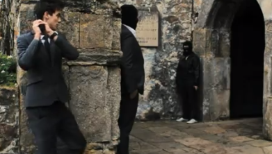
So, yet again, I looked at the film ATM. This film, however looked at a few times previously by others, I wanted to look at again, specifically focusing on Mise en Scene, and where different things were placed, ignoring the killers attire, unless it linked to the layout of the scene. Knowing that everything in each scene within a film is put there for a reason, I took screenshots of the scene that showed the killer's den, analysing it. This is shown below- within the screenshots, it shows the "play" button for the film, which I was unable to get rid of-:


Within this film, the killer's den seems to be some kind of storage unit within a public building. To the left and right, you can see the look of the outside of the den.


As it shows the killer open the door to his "den" within the storage unit place, stacked up brown boxes are shown to be in the room- nothing special-, however, these boxes and this room is just a "front" so that if anyone went in there, they wouldn't see the real purpose of the room. There is a hidden compartment that when the killer moves a section of the wall away, leads to the killers main room.


The killers real den isn't shown at much length or in much detail, but what is shown is his desk, where he draws up his plans, with photographs and drawings littering the wall surrounding his desk. The small room is quite cluttered and messy, but in the "killers mind" organised so that he knows exactly where everything is.


From what I could see in the different angles and the editing of the film, I drew up a simple diagram of how I think the layout of the killer's den looks like:

 Pretty Little Liars- A's Den


I then went on to look at the Mise en Scene for another "den" of a killer/stalker within the tv-series "Pretty Little Liars". The killer, "A", has an apartment as a den, full of large, framed, expensive photographs of the girl that he is stalking.

 Two large white boards reside in the "living room" of the den, holding a timeline with photos, notes and mementos from when the killer first started stalking his victims, to the present day.

Below shows a wall covered in photos of different people in his victims life, such as friends, family etc.

As the camera moved into the "den" further, the computer system where the killer puts all his research, surveillance material and information that he has collected about his victims that he uses for blackmail.

This "killers den" is much tidier, organised and spacious, linking to the different profile that this killer would fit. Having a large apartment to fill with the materials that he uses to commit his murders, he has filled it appropriately, indicating that he spends a lot of time in here. The room being so organised, however, gives the impression that not just one person goes in this room, possibly two, needing it to be more organised so that they can both still use that materials that they have collected- different to ATM.

The floor plan that I imagined, from the angles and editing that were shown, is shown below:

Our film opening floor plan

Now that i have done two deconstructions of two different "Dens", I have found the following "rules" that we should follow when designing our killer's den:

  • When there is only one killer, the den is quite messy, but organised so that the killer knows where everything is- it is quite dependent on the type of killer.
  • There must be a desk with the killers notes
  • There must be a "collage" of photos, mementos, notes etc on some part of the room
  • The objects in the room can make it cluttered or spacious, depending on the size of the den- but if its larger, the room must be full, not empty.
Thinking about all of this, and knowing that we are going to use Raman's garage as our killer's den, I drew up a simple first draw up of what our den should have in it, and where it should be placed:


Because we want the killer to kill his victims in his "den", I have indicated a "torture table", chair, table and plastic covering in the top left corner of the room. The torture table is where the victims will be tied down, the chair is where the killer will sit when he cuts the foetus out of his victims. The extra table is where the killer will place the organs and intestines, in a dish, along with his tools, such as a surgeon would have. And finally, the plastic covering is there to catch the blood that might fall onto the floor.

The table in the top right corner holds the record player with the song that the killer plays when he kills his victims.

And finally, the desk, two shelves and chair is where the killers notes and plans and photographs will be kept along with his diary.