
 To make this written diary, I got a plain lined note book at the pound store.
I wanted to make the pages look older and more used, so I coloured them with tea staining. This also made them look wrinkled and used, which is what we want.
 To the front cover, I thought that it would be an idea to make it look as if it is skin, and the killer has made this diary out of his victims skin. I covered the the original cover in tissue paper mache in layers, sewing the sides to make it look like the killer put the diary together himself. I used tissue with a texture to make it look realistically like dried skin. Once it had dried, I painted the textured cover in skin coloured tones.
I then decided to experiment with the writing type within the diary. I thought that it would be a good idea to make it look like the killer uses blood to write with, instead of ink, so I got a red ink, and started to write a few pages of possible entries that the killer would have written, putting myself in his shoes. Below shows the result of this investigation:


The only problem with these entries is that on camera, the "blood" looks too pink to look realistically like blood. This being a problem however, I liked the rough, hard to read writing that I felt that the killer would have, showing clearly where he was feeling passionate and emotional about what he was writing, having it in large, scratchy typography with droplets littering the page, adding the effect of making it look more realistic, old fashioned and creepy.
From this first trial, I decided to develop the design of it further, making the outside look more realistically like skin, and the blood ink look more like blood, deepening the colour.
 I started off with deepening the colouring of the tea stain on the pages, making the whole book look tea stained in irregular shapes and tones.
I then slightly adjusted the colour of the covering to make it look more leathery and dried. Covering the outside in liquid latex was an idea to make it look look more like skin. Peeling sections back and creating texture and blistering. Below shows the result of this effect on the outside of the book:

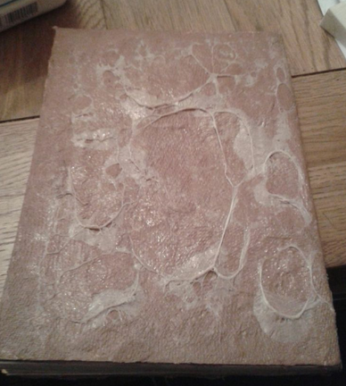
This shows the front of the book cover This shows the back of the book cover


The next step in making this look better was to deepen the colour of the "blood" writing.

 To do this, I mixed the red ink with some black ink, using a quill to write the entries. As you can see from the photos to the left and right, this time, the product was much better, and on camera, it looks more realistically like blood.
Now that this is finished, we can use this prop in our film opening. It will be used as the killers diary and will appear within the opening when the killer writes another entry about the murder he has just undertaken. The final product is shown below:

No comments:
Post a Comment