However, during the half term that I had to do this, I could not find any willing participants to be the model for this scene as it was inconvenient for them to come over at one time, or they were busy doing other things. In the end, I had to do it as a last minuet thing with my sister, who was not very willing, but agreed to help me out. This was quite worrying to me, being that if someone couldn't give up an hour or two of their time, how would we get a few people to do the whole film opening. This is an issue that we will have to address soon.
So on the day before we went back to school, I attempted to create this scene:
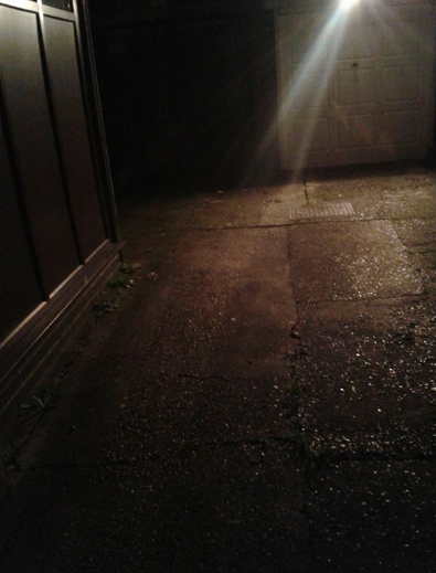
The location of this death scene is an alleyway next to my house, at around 5 pm. The location is shown in the pictures to the left and right, and as shown, I experimented with the lighting before hand to get an idea of what type of lighting would be appropriate.


To the left you can see the motion sensor light from the garage, giving off a visible beam towards the ground in front of the building. This could be where the body is shown.
 To the right is the same alleyway, but with the main light not working and a pale light shining towards garage. This low- key lighting gives an eerie effects, adding tension to the image.
 To the left is another low-key lighting effect, however, the camera is angled towards the garage, coming from the wall, as if its in the view of someone who is hiding- possibly in the killers point of view.
The final photo to the right shows an even darker lighting, illuminating only a small section, making the image go into darkness- adding to the tension and the fear of the unknown.

 After putting the special effects makeup on my model, I positioned her on the floor of the alleyway, as if she had been attacked and murdered- her throat slashed. Below shows the shots of this scene:
To the left and right shows my model at a close up shot with her throat slit and blood on her shirt, with bruises on her face, and dirt on her all over her- as if she had been in a struggle, restrained and murdered.
The lighting is quite high-key, illuminating the face- the photographs would be more appropriate as police shots of a victim than the killers shots of his work, or a memory- not wanting to be caught, and more subtle when killing the victim.

 The photograph to the left has more appropriate mise en scene, being that the victims eyes are closed, the blood is illuminated against the light shirt, and the lighting is more low-key, for the killers memory, or is photograph of his victim.
The final photo above shows my victim from further away, the light from the motion sensor light streaming down on her. It is, however a photo that would not be taken by the killer- or be in his memory of his victim, as the mise en scene isn't quite right.
The finished result of this first death scene for our killers diary turned out to be okay, however, I do feel that we need to do it again, using this as a trial death scene and an example of what obstacles we will have to avoid or overcome. I will be doing another post, planning the death scenes that we are going to create- where they will be located, the way the killer will kill his victim and the type of person that our killer is going to be focusing on.

No comments:
Post a Comment