Tuesday, 29 October 2013

The Killer's Trophies

As a group, we have decided that our killer will be focusing on  pregnant women, possibly themed at under-aged pregnant teenagers. And, as per a convention of a slasher genre, we have decided on the "trophies" that the killer will keep are the foetus' of the women that he murders.

This sick and twisted idea, has to be research, to see how to portray the removal of the foetus, and to think about how the killer can keep them, to be his trophies. Looking into different ways to preserve organic material, I found that formaldehyde is the most common mixture used. It has been used in art to preserve animals after they have died. It has also been used in other slasher movies.

Typing "foetus in a jar" into Google, the following photographs came up, all of which could be used as an inspiration for our style of trophies that the killer creates. The photos are shown to the right.

Thinking of ways that we could represent this, I thought that we could get a foetus like doll to be the foetus- or we might have to make one with special effects makeup, if the doll doesn't look realistic enough. We could use jelly as the formaldehyde and a large glass jar to hold it all.

I looked into different ways that we could make the foetus, if we need to do so. Below shows a You Tube tutorial that I found, that I thought could help us with this:

In this tutorial, it literary shows you how to make a foetus out of a number of materials that would be early accessible to us.

He starts off with some silver foil, shaping it into a ball initially, and adding a "tail" like piece to that ball. The structures is then added to with bendable wire, shaped into the arms and legs of the foetus.

Clay is then added, covering the structure with the skin like material making the basic form of the foetus. Features are carved into the clay, such as the eyes and the nose- they eyes holding a black bead that is then going to be painted.

The substance that he puts the foetus in is a mixture of water and glue and food colouring and a "jell", all creating a sludgy substance for the made foetus to stay in.

From this You Tube tutorial, we can take aspects of the ideas that were mentioned, to make our own foetus in a jar.

We will have a go at making this using silver foil, paint, clay and wire to make the foetus, a large jar that I had at home for the container and water and jelly as the liquid, but currently as we are not 100% on this idea, we are going to hold back to save materials at the moment.

Through my research, I also found out that in the movie Creep, the killer does a similar ritual, by taking out the foetus of pregnant women that he captures her, keeping the dead foetus in a jar next to his surgery table. Screen grabs of these are shown below:

To the left and right, you can see the trophies that "Creep" has kept of previous murders that he has committed- the foetus' of the pregnant women that he has killed. He has placed them in jars, within a liquid to stop them from decaying- the idea that we had for our props in the film opening that we are planning to create.

To the left, you can see that "Creep" is fermenting the foetus in this preserving liquid within a tub. This is the first step before putting the foetus into the jar and onto the shelf, keeping it as a trophy of his murder.


Because of the idea of our killer being obsessed with foetus' and  pregnancy, I found a few pictures that we could add into his diary, showing drawings of the different stages of the foetus growth, and the positions of the foetus within the body. As an effect, we would have the last stages of foetus growth crossed out, symbolising his hatred of the offspring produced.


To the left and the right, you can see the position of the foetus. This, although repulsive to a viewer, could be part of his obsession, performing the act of surgically removing the foetus perfectly, knowing everything that there is to know about it- possibly even trained at school how do do it.


To the right, there is another drawing of the foetus in the womb, but holding two growing babies. Maybe we could link the idea of twins- one being good and the other being evil- to our opening scene.

On the right is a Da Vinci drawing of a foetus- linking to anatomy, and the accurate precision of the surgical removal of a foetus.

Friday, 25 October 2013

Practical Investigation of Lighting & Camera Angles on Killer's Hands

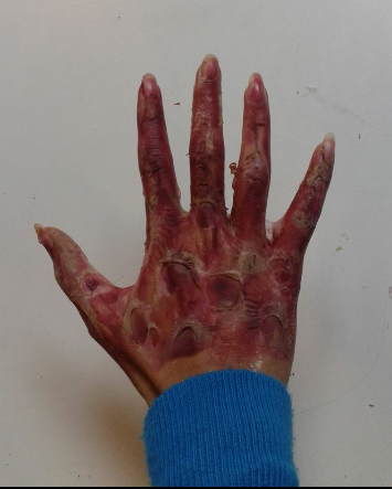
This was one of my hands and Annie had made it look like it had been burnt and these are the scars. This burnt hand reminds me of Freddy Krueger's face in Nightmare on Elms Street because he was also burned.

 This was my other hand and this was made to look bruised and bloody. The palm of my hand was covered in fake blood to make it look like I had just killed someone, and the back of my hand had scars, blood and bruises on it.

Both of these hands could potentially be what the killer's hands look like. The burnt hand was the most gruesome judging from other people's reactions so we could make both of his hands look burnt. However, if so, then we would have to bring the element of fire into how the killer kills his victims. From my research on victim's bodies I found the convention of slasher films was that most were left bloody so the scarred and bloodied hand could be used for our final project.
 

Lighting Investigaiton for the killer and the victims

As we have really starting to look how we will be able to film our idea for our film opening, I felt that it would be worth my time to look at the different lighting used in other slasher films, and how the killer and the victims differ in the lighting that they are exposed to.

I looked at five different extracts from different you tube clips of slasher movies. The best places, I found, that you can really see the contrast in lighting between the killer and his victims is when he is attacking them, and so most of the extracts are of the death scenes within the films.


In this extract, the main killer is always shown to be highlighting her face, but adding shadow to the eyes and other areas, to add the sense of mystery and secrets that her character would portray. She is also shown with a back-lighting, as shown in the screen shots to the left and right, adding to the her mystery, but also making her look dominant and more intimidating.

There are two victims that she is trying to kill. An older woman, and a young man. The young man is her first subject, and the lighting on him is shown to be quite harsh and open, as if he is being put uncomfortably exposed. The second victim, as shown above, is more in the shadows, even compared to the killer before he is killed, making it so that the audience are focused on the first victim and the killer most of all.

 When the killer turns onto her second victim, the older woman, the light becomes harsh and exposed on this victim, signifying to the audience that it is now her turn to be killed.

The main aspect of this extract that i really liked was the back light coming from behind the killer, making a silhouette of the bottom of the cloak that she is wearing, and the mask on her face. This makes the killer look more intimidating because of the fact that you cant see the dark suit that she has on, only the white face. The back light also makes her look superior, having her in the background, as one of her victims, with harsh street lighting poring down on him as he dies slowly and painfully.

The whole image has low key lighting- as it is at night.

Within this clip of the final scene in Orphan, the two victims are the mother and child, and the killer is the orphan. 

The overall lighting is similar to the other extracts that i have looked at. The lighting is quite harsh on the victims, and highlighting but casting shadows on the killer. To the left, you can see a screen shot where the victims are shown with this lighting, the expressions on their faces showing their despair and grief over their, supposedly over, ordeal with the killer.

Through the sequence, there were a few scenes where one of the victims and the killer were both silhouetted, shown to the left, amidst their "fight to the death". This is a really nice lighting effect, denoting that the result of the fight is unknown, and is still going on, and the contrast of the black shadows and the white snow and ice could symbolise the innocence of the victims and the evil of the killer.

The killer, as shown to the right, is always shown to be in a low key lighting, emitting the mystery and unpredictable tendencies of her nature.


The last two you tube extracts that i found, both were collections of death scenes, and the confrontation of victim and killer. This is what i took from them:


In every killer is shadowed, and in low- key lighting with aspects of their features highlighted. And every victim had harsh lighting, showing off their terrified features, their venerability and showing their exposure to the killers wrath:

Killer
Killer


Victim
Killer


Victim
Victim
Killer
Killer

Deconstruction of Jigsaw's backstory:


Deconstruction of Jigsaw's back story from Saw:

John Kramer/Jigsaw (Saw

File:Sawiii.jpg

~ The Saw films, are all based around the story of John Kramer (also known as Jigsaw) who sets up traps for people which are difficult to escape from, rather than kill them directly and this makes him different from other serial killers. John Kramer was a devoted husband to Jill who unfortunately had a miscarriage, this made him become more detached and angry, which eventually caused the divorce between him and Jill. John was then told by a doctor that he had cancer, an inoperable brain tumor, he was dying and nothing could be done about it. 

~ Depressed at the futility of life, John attempted to commit suicide by driving his car over a cliff but he survived, discovering that when he knew he was about to die he only really began to value his life. John observed other people, going about their everyday life and noticed people who were wasting their life, undeserving and unappreciative of the life that was being denied to him. He began a mission to make people appreciate their lives and realise how precious life is, one by one.

~ John began to observe and plan how to kill his victims, (who he called "subjects"), creating devices to test their desire to live and whether they were worthy or not. He places his victims in the lethal traps with a chilling message, explaining what crime they had committed to land them in the trap and how they could escape. The traps often involved quick thinking, difficult decisions, self-mutilation or psychological trauma, that John would watch.

~ As the number of his victims increased, he was known as the "The Jigsaw Killer" or "Jigsaw", mainly because he would cut a piece of flesh from the corpse of each unsuccessful victim, meant to represent the one thing that the victims had been missing; the survival instinct. 

~ I like the idea of the main character having a back story as I think it's important there is a reason for them murdering people, even if it isn't that obvious to the audience. As we only have a short amount of time for our coursework, it would be extremely difficult to explain the motivation of our villain, but I think it might be good to include hints, for example a flashback, even if it's a few seconds long,  showing a major event from their past could give a hint as to why they are so murderous now. 

Deconstruction of Villains' weapons:

Deconstruction of the weapons used by the villain in slasher films:

Jason Voorhees's machete (Friday the 13th Franchise)


~ In the Friday the 13th franchise, the main villain Jason, began to use a machete which became his weapon of choice and his trademark throughout the films. None of his victims could survive after one 'slash' of his blade.
~ I think the fact that it is quite simplistic is more effective, he doesn't use any gadgets or fancy technologies like in Saw, it's just a really large sharp knife but the slashing of his victims must be quite gruesome and very bloody.

Leatherface's chainsaw (Texas Chainsaw Massacre Franchise)


~  In the Texas Chainsaw Massacre franchise, the trademark weapon used by Leatherface is a chainsaw (which is referenced in the title). Along with the dangers that are visible when using a chainsaw, in my opinion the ominous revving sound of a chainsaw is really creepy and deadly, considering how much damage it can do. This is another example of a murder weapon that is easily recognised with the character and movie franchise and I think the idea of this would be very effective if we could choose a good object to turn into a 'well-known instrument of death'.

Freddy Krueger's glove (A Nightmare On Elm Street Franchise)


~ Freddy Krueger, in A Nightmare On Elm Street, created his own murder weapon by attaching razor blades to his glove at the end of his fingers, meaning he could slash, cut and stab into his victims. Coupled with his creepy appearance, the weapon is deadly, gruesome and in a weird way, quite clever along with the fact that he kills his victims in their dreams, bringing in an element of psychological horror. Also this is a unique weapon, which makes the character and therefore the franchise more successful because it hasn't really been seen before.

Harry Warden's pickaxe (My Bloody Valentine)


~ In My Bloody Valentine, Harry Warden is a miner and he wears a blue-collar workman's suit with a hard hat and gas mask so to complete his 'look', his favourite weapon is a pick-axe. Again it's quite a simple, common tool, but it's how the villain uses it which makes it so murderous and terrifying, for example he often uses it to stab into the victim and cut out their heart and then leave it in Valentine candy boxes, emphasizing the title of the film. 

~ The main thing I noticed when looking at weapons, was that each villain always has a trademark weapon that is recognisable to their character and to make them memorable. I think an idea for our coursework would be to have one specific weapon that the villain prefers but have a variation of murdering methods so it's not always the same. 
"Part of it was an objective goal to make the character memorable, since it seems that every character that has been successful has had some kind of unique weapon, whether it be a chain saw or a machete, etc. I was also looking for a primal fear which is embedded in the subconscious of people of all cultures." - Wes Craven, creator of Freddy Krueger.
~ I think this quote from Wes Craven sums up what we need to think about when deciding on the weapons for our murderer, it should be unique (hopefully not seen before) but a normal, everyday object that can have a second, more deadly use and obviously it should be scary enough to frighten the audience.  

Thursday, 24 October 2013

Killers hands Special Effects Investigation

Because of our idea of the killers diary, I decided to do an investigation into what the killers hands would look like- being that there may be close ups of it within the film opening that we are going to make, when the killer is writing in the diary.

Researching around, I could not find any inspiration for "killers hands" in any slasher movies, or even on Google. Not even the film seven was much help, as even though in the opening credits you see sections of the killers fingers, you never see his entire hand. This being said, I had a go anyway, improvising on the different hands that our killer could have.


The first thing that I did was to cover the hand in liquid latex. This, when the fingers were touching, made the latex stick to itself, making strings of the material going between her fingers, which I thought was a really cool effect.


I then pulled holes in the latex, adding layers of it so that it looked like blisters and saws. I then covered the hand in old looking scars, as if the killer had been badly burnt several years ago. This could possibly link to a back story of the killer, showing the motivation for killing people, for him. Above is an image of the final product.


I then tried out another design for the killers hands. A much more subtle makeup showing some nasty scrapes and blisters on the skin, along with a couple of older scars across the hand. This would be a more realistic representation of the hand, however the deformity of burn scars or another modification would be good as an introduction to the back story of why the killer is doing what he is doing.

The final experimental hand for the killer that I created was the one shown above. This is a rather gory, however linking to the slasher genre, piece with three nasty wounds. The first, and most obvious is the finger that has been cut off. Then there is a knuckle injury and a horrible looking blister. This design is rather extreme, and could be used as a thing towards the end of the film- of which we wont be doing- but its a good idea- or after a particularly nasty struggle of one of his victims.

Overall, from the different experiments that I have carried out, I feel that if we combine the idea of a physical deformity leading to the back story of his motivation to kill, and this deformity being a shock to the audience, making him look therefore scarier, but also the less gory more subtle look to make it look more natural- he wouldn't have open bloody wounds all the time.

Practical Investigation of Locations


In ATM (2011) the killer has a garage room within a large garage complex. My garage has shutters that look identical to those of ATM's. So, already this garage could be appropriate for our project because it is a 'typical' modern looking hideout for a killer.


It is very messy and there are shelves which we could put things on, such as black bin bags which could contain bodies, and we could make a hand come out of one so the audience knows that the bags contain dead bodies. Or, we could put chains, knives and other harmful weapons on there so the audience establishes that this garage is where the killer kills people.
 Standing at the end of the garage the door looks quite far away and in our opening, we could have the character looking at the door in a POV shot, and that could portray how the door, her only way of quickly escaping, seems too far away, and that she knows she is about to die. This will make the audience feel sorry for her, but also wonder what has made him want to kill her.
There are cracks along the walls and the ceiling, and the walls aren't painted and have plaster splattered all over them. This makes the garage look like the killer doesn't cares about decorating it, he only uses it to hide and kill people.


Next, I looked in my attic. It is quite big and there are joists and framing along the attic. Moving around the attic is difficult because of the framing so moving lighting and other props may be difficult. However, we could take advantage of this and, perhaps, print 'bloody' hands on the framing to make it look like the victims tried to saved themselves by gripping onto it. This would help identify our slasher genre, also bloody hand prints are a typical slasher convention to show the audience that people have been killed there.

The single light bulb within the vast attic creates a dim and low key lighting. This produces a somber atmosphere which reflects the killer's personality, thoughts and actions. However, if we were to film using that one light bulb, we would not be able to see much so we would have to bring other sources of light.
This brick wall is intriguing, especially if it was to be used as the killer's den because the bricks are flawed. Also, none of the attic is decorated, and this wall has not been plastered and painted and this, like the garage, could characterize the killer into being careless as to where he kills his victims, but determined to do it.
Also, there is a chest in the corner of the attic which is similar to the one in Sinister. It makes the audience begin to wonder what is in there and whether is has something to do with the victims or the killer.